Have you ever clicked on a product page and felt like time flew by without you even noticing? That is the magic of a “flow state.” In this article, you will learn how to make shoppers feel so immersed on your Shopify product pages that they lose track of time and keep exploring. By the end, you will have fresh ideas on how to design, measure, and maintain flow on your store. Ready to begin?
Chapter I: Understanding Flow State in E-commerce
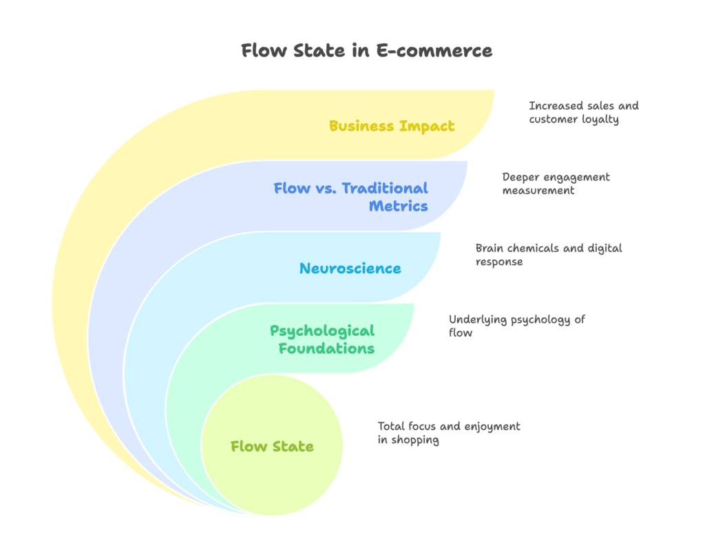
In this chapter, we will explore what flow state is and why it matters to your Shopify store. You will discover the basics of flow psychology, how our brains react in digital environments, and the difference between flow-driven engagement and traditional metrics. By the end, you will see exactly why flow optimization can be a game-changer for any Shopify business.
Defining Flow State and Its Psychological Foundations
Flow state is a feeling of total focus and enjoyment. Psychologist Mihály Csikszentmihalyi described it as that moment when you are fully absorbed in an activity, losing track of time and external distractions. In the world of e-commerce, this translates into shoppers browsing your site with undivided attention. They feel engaged, curious, and eager to continue.
The Neuroscience Behind Flow in Digital Environments
When someone enters flow, their brain releases feel-good chemicals like dopamine. This increases a person’s motivation to keep going. On a Shopify store, a smooth user experience and clear design cues can encourage these positive signals, keeping people interested longer. If the journey feels effortless, users often move toward checkout without realizing how much time has passed.
Flow State vs. Traditional Engagement Metrics
Typical engagement metrics, such as bounce rate or time on page, give us basic insights. However, flow state takes engagement to another level. Instead of just measuring clicks or views, flow measures how much shoppers are enjoying the experience. This deeper measurement focuses on the user’s psychological connection with your store.
The Business Case for Flow-Optimized Shopify Stores
A flow-friendly environment can lead to more product views, higher cart sizes, and repeat visits. In short, flow is good for business. When visitors have a pleasant and absorbing experience, they often become loyal customers who return for more.
Curious about how to shape this feeling of immersion on your own product pages? Let’s move to the next chapter and find out.
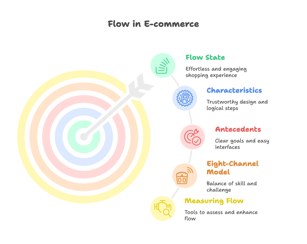
Chapter II: The Anatomy of Flow on E-commerce Platforms
Here, we will break down the features that create flow. You will learn about the signs of flow in online shopping, the conditions needed to spark flow, and how to measure it. We will also talk about the Eight-Channel Model of Flow and see how it fits into Shopify experiences. Stick around for the end of this chapter to understand why flow can lead to bigger smiles and larger carts.
Characteristics of Flow in Online Shopping Environments
Flow in e-commerce often shows up as a sense of effortless browsing. Shoppers click, read, and explore without feeling bored or confused. They trust your site’s design and find each step logical. There is a perfect match between the shopper’s skill and the challenge level of your website.
Antecedents of Flow State in E-commerce
Several factors set the stage for flow: a clear goal (“Find the perfect pair of shoes”), an easy interface, and immediate feedback (“Your size is available!”). When these elements come together, people stop worrying about how to navigate. Instead, they focus on exploring your products.
The Eight-Channel Model of Flow Applied to Shopify
Csikszentmihalyi’s model divides a person’s experience into eight channels, ranging from apathy to flow. Each channel reflects the balance between skill and challenge. On Shopify, the ideal scenario is when users feel neither overwhelmed nor under-challenged. This balance encourages them to continue without frustration.
Measuring Flow Experiences in Digital Commerce
Surveys and user tests can capture how individuals feel while shopping. Tools like heatmaps and scroll tracking can show whether they move freely through your pages or hesitate often. By understanding these patterns, you can adjust your layout and content to boost flow.
Flow State as a Predictor of Customer Satisfaction and Loyalty
When shoppers experience flow, they often rate their experience positively. They may write reviews or recommend your store to friends. The good vibes they feel can translate into repeat visits and trust in your brand.
Now that we’ve mapped out how flow appears on an e-commerce site, we should talk about what can stop it. Ready? Let’s continue to Chapter III.
Chapter III: Barriers to Flow on Shopify Product Pages
This chapter looks at common pitfalls that interrupt flow. We will discuss issues like too much information, clumsy designs, mobile-related difficulties, technical slowdowns, and the problem of pushing too many choices on users. By the end of this chapter, you will know what to avoid so that visitors stay engaged.
Cognitive Load and Information Overload
When users are flooded with too many details, they feel mentally tired. If every scroll or click leads to more clutter, they exit your store quickly. Reducing needless text and visuals can keep their minds clear and comfortable.
Disruptive Design Elements and Flow Interruptions
Pop-ups, sudden animations, and unrelated banners can break immersion. These distractions jolt the user out of their browsing rhythm. Keep your layout clean so that visitors stay focused on the content that matters.
Mobile-Specific Flow Challenges
On smaller screens, it’s easy for text and images to become cramped. Poorly optimized mobile layouts lead to scrolling that feels endless or buttons that are too tiny. Simplifying your design and using mobile-friendly features keeps the flow going.
Technical Barriers to Immersive Experiences
Slow loading times or broken links are major turn-offs. Users may try once or twice, but if the site lags, they leave. A stable and fast website is key to preserving flow.
The Impact of Forced Options and Psychological Reactance
When shoppers feel pushed into certain choices (“Sign up now or lose access!”), they often back out. Giving them a sense of freedom helps them continue in a relaxed and positive mood.
We have identified trouble areas. But how do we fix them? Let’s press on to Chapter IV to discover how to design product pages that support flow instead of breaking it.
Chapter IV: Designing Product Pages for Optimal Flow
In this part, we will learn ways to arrange product pages so that users enter a state of uninterrupted focus. Topics include visual hierarchy, balancing the user’s skill with challenges, setting clear goals, offering quick feedback, and minimizing distractions. By the end, you will have practical ideas to apply on your own Shopify store.
Visual Hierarchy and Attention Economics
Our eyes follow a natural path on a page. By placing key information (like product name and “Add to Cart” button) in prime spots, you guide visitors smoothly. Use headlines, bullet points, and appropriate spacing to lead the eye.
Balancing Challenge and Skill Level in Navigation
A site that is too easy to navigate can feel dull, while a site that is too tricky to use causes frustration. Aim for a layout that gives just enough guidance without doing everything for them. This keeps shoppers active and alert.
Clear Goals and Progress Indicators
State the purpose of a page, like “Pick your favorite T-shirt color,” and show how far the shopper is in the process. Simple checklists or visual cues let them know they are on track, which fuels their motivation to finish.
Immediate Feedback Mechanisms
When a user chooses a color or size, let them see the result instantly. This could be a quick animation or text confirmation. Each small confirmation helps maintain flow by removing doubts.
Reducing Distractions and Focusing Attention
Remove elements that take users away from the main task. Keep your layout clean, ensure any pop-up is relevant, and consider a design that makes the product images stand out. This reduces the chance of wandering minds.
We’ve now explored how to build pages that encourage a smooth experience. Next, let’s talk about the content that goes on those pages. Get ready for Chapter V.
Chapter V: Content Strategies That Enhance Flow
This section focuses on how to write and structure information to spark a deep connection. We will cover how storytelling, product descriptions, visuals, interactive content, and user-generated content can work together to keep readers hooked. By the end, you will see how words and images can create a seamless journey.
Narrative and Storytelling Techniques
Everyone loves a good story. Share how your product was made or the inspiration behind it. This makes your brand more relatable and keeps people reading to find out what happens next.
Product Description Optimization for Cognitive Fluency
Use short, clear sentences and focus on benefits that matter to your audience. Avoid heavy jargon. When people understand details quickly, they remain in the zone without mental strain.
Visual Content That Maintains Immersion
High-quality images and short videos help shoppers picture themselves using your products. Display multiple angles or show an item in real-life settings. This visual engagement adds depth to the browsing experience.
Interactive Elements That Deepen Engagement
Slideshows, 360-degree product views, and quick quizzes are fun and informative. They let customers interact with your brand in a playful way, making them stay longer.
User-Generated Content Integration for Authentic Experiences
Reviews, customer photos, and testimonials make your store feel genuine. Shoppers trust feedback from people like themselves. This trust encourages them to keep browsing.
We’ve touched on the power of text, images, and user stories. Next, let’s explore the technical aspects that keep everything running smoothly in Chapter VI.
Chapter VI: Technical Implementation on Shopify
In this chapter, we focus on the behind-the-scenes work that enables flow. Topics include page speed, apps that help enhance flow, custom themes, mobile responsiveness, and A/B testing. By the end, you’ll know how to set up your Shopify store so that it delivers a seamless experience for every visitor.
Page Speed Optimization for Uninterrupted Flow
Faster pages keep users engaged. Compress images, reduce large scripts, and pick a reliable hosting environment. Each second saved in loading time helps maintain flow.
Shopify Apps That Enhance Flow Experiences
Some apps provide features like personalized recommendations, gamification, or chat support. When integrated well, these tools can make browsing more fun. Pick apps that align with the flow experience you want to create.
Custom Theme Development for Flow-Optimized Pages
A custom theme gives you full control over layout, navigation, and visuals. You can remove or hide features that distract from the main path. Keep it simple yet appealing.
Mobile Responsiveness and Flow Maintenance
Make sure your images scale and your buttons are easy to tap on smaller screens. A mobile-friendly layout is vital for keeping people in the zone, especially as more shoppers switch to phones and tablets.
A/B Testing Framework for Flow Enhancement
Test different page elements to see what keeps users engaged. Compare variations of your product descriptions, image sizes, or placement of call-to-action buttons. This data helps you find the best combination for maximum flow.
With the technical side sorted, we can look at broader navigation choices. Let’s step into Chapter VII to explore how to design category pages and more.
Chapter VII: Flow-Optimized Navigation and Browse Experiences
Here, we talk about how users move through your store. We will cover category page design, search features, filters, cross-selling, and smooth transitions. By the end of this chapter, you’ll have a roadmap for guiding visitors from one part of your store to another without breaking their sense of immersion.
Category Page Design for Continued Flow
A clear and logical category page helps shoppers find what they want. Use short category names, helpful images, and consistent labeling. Each click should bring visitors closer to their goal without confusion.
Search Functionality That Maintains Immersion
A fast, accurate search bar keeps people in the zone. Suggest possible matches as they type, and make sure the results are relevant. Slow or unfocused search results disrupt the flow.
Filtering and Sorting That Enhances Rather Than Disrupts
Filters should be easy to use and load quickly. If sorting or filtering feels clunky, shoppers get frustrated. Give them clear options (color, size, price) that help them narrow down their choices in a smooth way.
Cross-Selling Without Breaking Flow
Suggest related items at natural points, like after a user adds something to their cart. Avoid large pop-ups that block the page. Subtle, timely suggestions can spark additional interest without ruining the moment.
Transition Design Between Page Elements
Each click should feel like part of a continuous journey, not a jump from one disconnected page to another. Smooth transitions and consistent layouts keep the user’s mind focused on exploring, instead of recalibrating with each new page.
We’ve seen how to keep users moving smoothly. Next, let’s examine how product discovery itself can be an engaging adventure in Chapter VIII.
Chapter VIII: The Psychology of Product Discovery in Flow
This chapter digs into how people find new products on your site. We’ll explore personalized suggestions, curiosity triggers, balancing novelty with familiarity, and ways to create loops that keep customers browsing. By the end, you will be able to create an atmosphere of pleasant discovery.
Recommendation Engines That Maintain Flow State
Algorithms that highlight items based on a user’s past actions can feel like a personal shopper. Relevant product recommendations keep people interested, but only if they are matched properly. Irrelevant suggestions can break immersion.
Personalization Strategies That Enhance Immersion
Offering product ideas based on browsing history or purchase history helps users feel understood. Show them items that align with their interests, and they are more likely to continue exploring.
The Role of Curiosity in Sustaining Flow
Subtle hints about new or trending items can spark a sense of wonder. When visitors feel curious, they click deeper into your store, extending their stay and fueling that flow state.
Balancing Novelty and Familiarity
People like fresh experiences, but they also want a sense of familiarity. If your site is too unusual, it can be off-putting. If it is too generic, it can be boring. Aim for a middle ground to keep them engaged.
Creating “Browse Loops” That Maintain Engagement
When recommended items lead to more interesting choices, you form loops of discovery. This continuous chain of “What about this item?” can keep shoppers happily moving from one product to the next.
Now that we have discovered how to keep people looking for products they love, let’s see how to make the checkout process flow-friendly in Chapter IX.
Chapter IX: Checkout Processes That Preserve Flow
In this section, we’ll look at ways to maintain flow during checkout. We will cover how to shorten the path from product to purchase, reduce form fields, and keep shoppers updated at each step. By the end, you’ll see how a smooth checkout can feel like a natural extension of your product pages.
Streamlining the Path from Product to Purchase
Reduce the number of clicks between adding an item to the cart and finalizing the payment. This straightforward path keeps the energy alive and stops second thoughts from creeping in.
Minimizing Form Fields and Cognitive Load
Long forms can make people abandon their carts. Only ask for the information you really need. When forms are short, users move more quickly and stay in the zone.
Progress Indicators and Feedback During Checkout
Show customers their progress: shipping details, payment, and confirmation. A small tracker or a few simple icons let them know they are moving forward, which keeps them engaged.
Payment Method Integration for Seamless Transactions
Offer popular payment options so that users recognize their favorite method quickly. Familiar payment gateways often mean fewer hurdles, resulting in a smoother final step.
Post-Purchase Flow Continuation Strategies
After checkout, suggest related products or share helpful tips on using the item. This keeps the relationship going even after the sale. It also encourages them to return to your store in the future.
We’ve now wrapped up the shopper’s journey from product page to checkout. But how do we measure flow and keep improving? Let’s check Chapter X for the final piece of the puzzle.
Chapter X: Measuring and Optimizing Flow on Shopify
This last chapter covers the metrics and practices that let you gauge how well your flow efforts are working. We will discuss which numbers to track, how to set up analytics, methods for user testing, and a framework for ongoing improvements. You will also learn about upcoming design ideas that might shape the future of flow-based e-commerce.
Key Performance Indicators for Flow State
Besides traditional KPIs like conversion rate, look for signals that shoppers find the site enjoyable. Average session length, scroll depth, and repeat visits can hint at flow. Surveys that ask about enjoyment or immersion are also helpful.
Analytics Setup for Flow Measurement
Use tracking tools like Google Analytics or specialized heatmapping software. Watch for where visitors pause or click away. Combine quantitative and qualitative data to get a full picture.
User Testing Methodologies for Flow Assessment
Invite real users to browse your store while you watch or record their sessions. Ask them how they feel after each step. Look for signs of frustration or boredom. Their feedback guides your next improvements.
Continuous Improvement Framework for Flow Optimization
Flow enhancement is not a one-time deal. It’s an ongoing effort of analyzing data, tweaking designs, and testing again. By making small adjustments over time, you create a more immersive experience that adapts to changing customer needs.
Future Trends in Flow-Based E-commerce Design
We may see more personalized shopping journeys, deeper storytelling, and interactive experiences as technology evolves. Keeping an eye on these trends can help you stay ahead and keep users engaged for longer sessions.
You now have a complete overview of how to inspire a flow state on Shopify. It’s time to put these ideas to work and watch your store come alive.
References
- Csikszentmihalyi, M. (1975). Beyond Boredom and Anxiety. Jossey-Bass.
- Wikipedia. (2025). Flow (psychology). https://en.wikipedia.org/wiki/Flow_(psychology)
- Emerald Insight. (2019). Antecedents and consequences of flow state in e-commerce. https://www.emerald.com/insight/content/doi/10.1108/jcm-10-2015-1579/full/html
- PLOS ONE. (2021). The role of customer experience in the effect of online flow state on customer loyalty. https://journals.plos.org/plosone/article?id=10.1371%2Fjournal.pone.0254685
- Bloomreach. (2024). Customer Flow Management & Purchases. https://www.bloomreach.com/en/blog/customer-flow-keeping-your-customers-on-track-toward-their-purchase
Ready to boost your Shopify store’s revenue with smarter discount codes? Growth Suite is a Shopify app that helps you do exactly that. Install it with just one click and get started on your path to stronger sales!