
Have you ever scrolled through a massive product list and felt your head spin? Maybe you ended up buying nothing at all because there were just too many choices. If you’ve ever experienced that kind of “stuck” feeling, you’ve encountered choice paralysis. In this opening section, we’ll explore what choice paralysis means, why it matters to businesses, and what we aim to achieve by understanding it. By the end, you’ll see how too many options can hurt sales and learn why simplifying choices is crucial for better conversions. Ready to dive in?
Definition and Concept
Choice paralysis is the struggle we face when we encounter more options than our brains can handle. Instead of feeling empowered, we freeze or delay making a decision. This phenomenon was famously discussed by psychologist Barry Schwartz, who introduced the idea of a paradox: more choices don’t always lead to better decisions. Historically, having more products was viewed as a sign of success. Today, however, we’re seeing that endless selections can chase customers away. When shoppers feel overwhelmed, they often leave without buying anything, causing businesses to lose valuable sales.
The Business Impact of Choice Paralysis
Multiple studies have shown that when consumers face too many options, conversion rates drop. For instance, e-commerce sites that offer countless similar products may see higher cart abandonment rates because buyers need extra time—or extra willpower—to pick just one. Across various industries, simplifying the decision process has become a major competitive advantage. Digital environments, with their seemingly infinite catalogs and links, can make choice overload even worse.
Article Scope and Objectives
In this article, we’ll lay out a clear framework for spotting choice paralysis and tackling it. You’ll discover practical strategies that can work for everything from online retail to subscription services. We’ll also look at ways to measure what’s working and what isn’t, so you can keep refining your approach. Our goal is to show you how evidence-based techniques can truly simplify choices without sacrificing variety.
Curious about the deeper psychological reasons behind choice paralysis? Let’s move on and see what’s happening inside our minds when we face too many options!
The Psychology Behind Choice Paralysis
In this section, we’ll dig into the mental processes that lead to choice paralysis. By understanding the brain’s inner workings—like how we handle loads of information or how we burn out after making too many decisions—you’ll be better equipped to create a shopping experience that doesn’t overwhelm your audience. Let’s see what science has to say!
Cognitive Mechanisms
One key idea is Hick’s Law, which suggests that the time it takes to make a decision grows logarithmically with the number of choices available. In simpler terms, the more options you have, the longer it takes to pick one. Another factor is cognitive load, which refers to the mental effort required to process information. When users have to compare many products at once, they may feel confused or stressed. Our brains also toggle between System 1 (fast, intuitive thinking) and System 2 (slow, analytical thinking). When we face choice overload, System 2 has to work overtime, and that can result in mental fatigue or stalled decisions.
Decision Fatigue and Mental Energy
Researchers have found that we have a limited “supply” of mental energy each day. Every choice—no matter how small—consumes a bit of that mental fuel. By the time you reach the end of the day, making any more decisions can feel like a climb up a very tall mountain. This is why some people prefer to shop in the morning or after a break. If your website or store layout demands a lot of choices, you might lose customers who are already mentally tired. Decision fatigue can build up quickly and derail even the most determined shopper.
Emotional Factors in Choice Overload
Too many options can create anxiety and stress, as buyers start to worry: “What if I pick the wrong product?” This fear of regret can become so strong that people decide not to buy anything. Strangely enough, the more freedom we have, the less happy we might feel if that freedom comes with too many decisions. Psychology shows that post-decision satisfaction often decreases when shoppers suspect they might have overlooked a “better” choice among the many.
We’ve uncovered the psychological reasons that cause choice paralysis. Next, let’s see how these factors play out in the world of e-commerce, where an abundance of product options meets short attention spans!
Choice Paralysis in E-commerce and Digital Environments
This section will connect the dots between online shopping and the psychological elements we just explored. You’ll see the most common ways choice paralysis pops up in e-commerce, which conversion points suffer the most, and how mobile vs. desktop experiences can amplify the problem. Ready to reveal how these issues affect your bottom line?
Common Manifestations in Online Shopping
In online stores, product catalog overload can be a huge culprit. Imagine scrolling through pages of nearly identical products. Before you know it, you’ve spent an hour adding and removing items from your cart. Another challenge is comparing features that seem too alike. If the site’s structure isn’t clear, finding the perfect product becomes a chore. Even lengthy checkout forms can lead to hesitation if customers feel the process is too complicated.
Critical Conversion Points Affected
Choice paralysis can strike at any point of the customer journey, but it’s often most visible on product pages, cart pages, and registration forms. A high cart abandonment rate might not just be about shipping costs or login issues; it could be that shoppers are feeling overwhelmed by extras like warranty add-ons or multiple shipping tiers. Likewise, complicated search results can leave potential buyers stuck with too many options and no clear way to filter them down.
Mobile vs. Desktop Considerations
On mobile devices, limited screen space makes the design challenge even bigger. Cluttered layouts and tiny text can cause users to give up quickly. A simple, streamlined mobile experience is vital because mobile shoppers often browse on the go and have less patience. Still, consistency is key: if your website and your app present different sets of options or drastically different layouts, you risk confusing your customers across devices.
You’ve seen how choice paralysis can creep in during the e-commerce journey. Up next, we’ll dive into strategic frameworks that help reduce choice overload before it can harm your conversions!
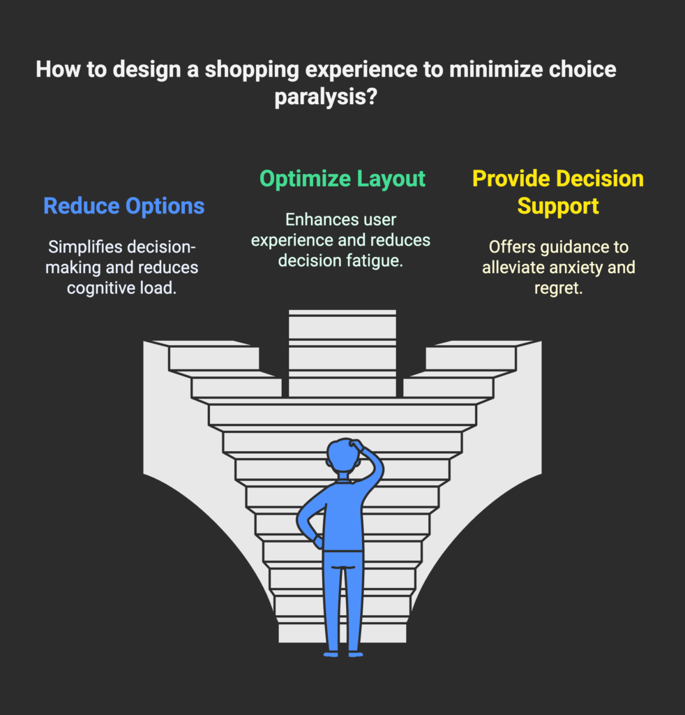
Strategic Frameworks for Reducing Choice Paralysis
Here, we’ll look at high-level strategies businesses can use to counter choice overload. We’ll explore optimal choice thresholds, principles of choice architecture, and the power of psychological triggers. Once you grasp these frameworks, you’ll be well on your way to creating a more focused and satisfying shopping environment for your customers.
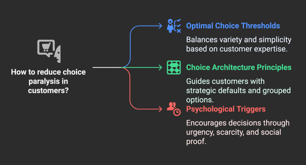
The Paradox of Choice Solution Matrix
This matrix helps you match the number of options to your customers’ expertise level. For example, experts may appreciate more variety, while newcomers prefer fewer, curated choices. There’s also a 3-5-7 rule that suggests limiting displayed options to three, five, or seven at a time. This approach balances the desire for variety with the need for simplicity.
Choice Architecture Principles
Strategic defaults are a classic example: presenting a “best value” or “most popular” option first can guide shoppers who don’t want to do all the research themselves. Progressive disclosure is another tactic, where additional details are shown only if the user requests them. Chunking groups related options together, making them easier to review.
Psychological Triggers to Overcome Hesitation
Urgency (like limited-time offers) and scarcity (like low-stock notices) can help spur decisions when a shopper is on the fence. Social proof—such as showing how many other people bought or favorited a product—can further reduce mental effort by implying, “If so many people chose it, it must be good.” You can also leverage trusted experts or brands to give “authority recommendations,” leading buyers toward a confident choice.
You now have some powerful frameworks in your toolkit. Next, we’ll explore how to put these frameworks into action step by step!
Practical Implementation Strategies
In this section, we’ll detail hands-on methods for reducing choice overload within your product pages, site navigation, forms, and checkout flows. By the end, you’ll have a roadmap for smoothing out any friction that’s keeping your customers from clicking that buy button.
Product Selection and Display
Curate a limited but high-quality selection whenever possible. If you have a vast catalog, highlight a few featured products to guide visitors. Make sure each product is unique enough that customers aren’t comparing nearly identical features. If comparison tools are available, keep them simple to avoid information overload. Consider including a recommended or “top pick” section to nudge shoppers forward.
Navigation and Site Structure
Your site architecture should naturally limit initial choices. This can be done through intuitive category organization—like broad groupings that filter down gradually. Provide clear search filters but don’t overwhelm shoppers with too many parameters all at once. Also, employ guided shopping or decision trees that help users find what they need step by step. Make it obvious where someone should click next, so they always know they’re on the right path.
Form Simplification Techniques
One of the easiest ways to reduce form abandonment is by cutting unnecessary fields. Ask yourself: Do I really need this information right now? Breaking a long form into smaller chunks also helps. Use smart defaults by auto-filling known details or using common choices (like country selections based on the user’s IP). Real-time validation can make the process smooth, so users see errors right away rather than at the end.
Checkout Process Optimization
Decide if a one-page or multi-step checkout works best for your audience. Either way, remove any distractions—like pop-ups or unrelated links—that might derail a shopper’s focus. When offering shipping or payment options, try to keep the list concise. If you do have many methods, highlight the one most users select. Include a progress indicator so customers feel confident about where they are in the process and how many steps are left.
These hands-on strategies are your building blocks for a frictionless user journey. Let’s now take a closer look at how these principles work across different industries!
Industry-Specific Applications
Different businesses have unique challenges when it comes to choice paralysis. In this section, we’ll examine how to adapt our strategies to fit e-commerce, SaaS, and financial services. By the end, you’ll see that no matter the sector, simplifying decisions can significantly boost conversions.
E-commerce and Retail
For retail, effective catalog organization is key. Instead of dumping thousands of items on a single page, consider grouping them into logical categories or collections. If you use filters, limit them at the first stage so that shoppers aren’t overwhelmed. You can also offer product bundles that package complementary items together, reducing the number of choices people have to make.
SaaS and Subscription Services
For subscription-based products, the focus often centers on pricing tiers. Many SaaS companies find success with three plans: a basic plan, a middle “best value” plan, and a premium plan. This simple lineup guides customers to pick the most suitable option without overthinking. Clearly show feature differences in a comparison table, but keep it uncluttered. Also, streamline the onboarding process by asking for minimal information upfront.
Financial Services and High-Consideration Purchases
Financial decisions like mortgages or insurance policies can be incredibly complex. Break down each choice into smaller steps, and provide interactive tools such as calculators or visual aids to simplify comparisons. A guided consultation process can also relieve stress by walking customers through questions tailored to their needs. Transparency is vital here: customers want to feel they are making a secure and well-informed decision.
You’ve seen how different industries tackle the issue of too many choices. Next, let’s explore how to test and refine your approaches so you can be sure they truly boost conversions!
Testing and Optimization Methodologies
This section explains how to measure the impact of your simplification efforts. After all, you can’t improve what you can’t measure. We’ll cover A/B testing, user research, and the key performance indicators (KPIs) you should watch to ensure your solutions are working.
A/B Testing Frameworks for Choice Optimization
One way to see if you’ve really reduced choice overload is to test different numbers of options. Present one group of users with three options and another with six, for example. See which group converts better. In addition, try different ways of displaying or highlighting your top picks. Keep an eye on statistical significance, so you know whether changes in conversion rates are truly meaningful.
User Research Techniques
Sometimes, metrics only tell half the story. In-depth usability tests, heat maps, and exit surveys can explain why users are hesitating. For instance, if a heat map shows people hovering over multiple products without clicking, you might suspect choice paralysis. If a user interview reveals people are unsure about shipping policies or warranties, consider making those details more obvious.
Key Performance Indicators and Metrics
Common metrics include conversion rate, time-to-decision, and cart abandonment rate. You can also analyze how many users click deeper into your site before making a purchase, sometimes called click depth. Tracking these KPIs across multiple stages helps you pinpoint exactly where customers get stuck.
Now that you know how to test and measure your success, let’s explore real-life stories of how choice simplification has transformed businesses just like yours!
Case Studies and Success Stories
Everyone loves a good success story, and in this section, you’ll find real-world examples of how simplifying choices helped boost conversions and user satisfaction. By the end, you’ll see that these strategies aren’t just theory—they work in practice, across various formats and niches.
E-commerce Transformations
Some online retailers have swapped huge product grids for curated collections. By limiting the number of highlighted items, they noticed an immediate spike in conversions. Shoppers reported feeling more confident with fewer, clearer options. In many cases, customer satisfaction also went up—people enjoyed a simpler, more guided shopping journey.
Form and Checkout Optimization Examples
Businesses that trimmed their checkout forms often saw a sharp drop in abandonment rates. For example, removing optional fields or converting a single lengthy form into a multi-step wizard made it feel less overwhelming. Some sites added real-time validations, telling users immediately if they’d made a mistake. The result? Fewer errors and higher completion rates.
Navigation and UX Simplification
Companies that reorganized their site menus and category pages found that new visitors spent less time searching and more time buying. By grouping items in logical ways and adopting straightforward labels (like “Men’s Shoes” instead of “Footwear for Him”), they turned a maze into a pleasant journey. This not only boosted sales but also improved overall brand perception.
It’s clear that simplifying choices leads to tangible benefits. Let’s look at what’s on the horizon for choice optimization, including AI-driven personalization and ethical considerations!
Future Trends and Emerging Best Practices
In this forward-looking section, we’ll discuss upcoming developments in choice simplification, from machine learning that personalizes selections to changing consumer expectations. You’ll also learn why transparency and ethics matter more than ever as you refine your choice architecture.
AI and Personalization
With machine learning, you can tailor product recommendations so customers only see what’s most relevant to them. This helps cut out the noise of irrelevant options. However, personalization must remain balanced; showing too few options can feel restrictive. Voice interfaces are another emerging avenue, streamlining the selection process by letting people speak their preferences.
Evolving Consumer Expectations
Shoppers today expect quick, painless experiences. They’re used to curated feeds on social media and might seek the same simplicity elsewhere. Additionally, younger audiences often value recommendation algorithms that save them time, while older audiences may prefer a bit more control. Either way, the modern attention economy means you have seconds to impress.
Ethical Considerations
Simplifying choices shouldn’t veer into manipulation. Provide default options and suggestions, but be transparent about why you recommend them. Accessibility is also crucial—layouts and text must be easy to read, and forms should be usable by everyone. When done right, choice architecture can serve both user satisfaction and business goals without resorting to shady practices.
We’re almost at the finish line! In the final section, we’ll compile these ideas into an action plan you can start using right away.
Conclusion: Creating Action Plans for Choice Optimization
Welcome to the final step of your choice paralysis journey. In this concluding section, you’ll learn how to perform an audit of your current processes, build a roadmap for changes, and keep your eyes on the metrics that matter. Let’s bring it all together!
Audit and Assessment Framework
Start by mapping out every decision point in your customer’s journey. Identify where customers linger, abandon, or express confusion. Gather baseline metrics like conversion rates and cart abandonment so you know what “normal” looks like. This helps you see which areas need the most urgent attention.
Implementation Roadmap
Quick wins might include removing extra form fields or adding a “recommended” label to guide uncertain buyers. Over the medium term, consider revamping site navigation or reevaluating your product lines. Long-term transformations might involve deeper brand changes or even adopting new technologies like AI-powered personalization. Continual testing ensures your approach stays fresh and effective.
Final Recommendations
Keep in mind that simplicity must not erase variety entirely. Balance is key. Commit to regular check-ins so that everyone in your organization—designers, marketers, product managers—understands the importance of clear choice architecture. Mastering choice paralysis not only boosts conversions but can also become a unique competitive advantage in a crowded market.
Thank you for taking this deep dive into choice paralysis. By applying these principles, your e-commerce journey will become more enjoyable for customers and more profitable for you!
References
- WiserNotify. (2023, October 28). What is Decision Paralysis? | Psychological Impact & Marketing. https://wisernotify.com/marketing-term/decision-paralysis/
- Red Website Design. (2023, November 6). How Reducing Options Can Increase Your Ecommerce Conversion. https://red-website-design.co.uk/reduce-options-increase-conversions/
- InsideBE. (2022, October 20). Decision Fatigue – Everything You Need to Know. https://insidebe.com/articles/decision-fatigue/
- Asana. (2025, January 21). 4 Tips for Overcoming Analysis Paralysis. https://asana.com/resources/analysis-paralysis
- Shopify. (2021, August 26). 5 Ways to Overcome Choice Paralysis and Improve Conversion. https://www.shopify.com/partners/blog/choice-paralysis
- Red Alkemi. (2024, September 11). Simplifying Forms for Higher Conversions: Best Practices for Lead Generation. https://redalkemi.com/blog/simplifying-forms-for-higher-conversions-best-practices-for-lead-generation/
- Pixolabo. (2023, July 12). How to Avoid Decision Fatigue Through Website Design[2023]. https://pixolabo.com/how-to-avoid-decision-fatigue-through-website-design/
- Focus Bear. (2023, June 9). Choice Paralysis ADHD: Tips for Easier Decision-Making. https://www.focusbear.io/blog-post/choice-paralysis-adhd-tips-for-easier-decision-making
- Schwartz, B. (2004). The Paradox of Choice: Why More Is Less. HarperCollins.
- Hick, W. E. (1952). On the rate of gain of information. Quarterly Journal of Experimental Psychology, 4(1), 11-26.
Extra Tip for Shopify Merchants: Don’t forget to check out Growth Suite, an app designed to help you streamline your store management and boost sales. It can simplify everything from product listings to checkout flows, ensuring you turn browsers into buyers more effectively.