You spend weeks perfecting your hero image. Hours writing product descriptions. Thousands on ad copy that stops the scroll.
But what about the “Submit” button?
What about the text that shows when someone adds an item to their cart? The error message when a credit card fails? The confirmation after checkout?
These tiny bits of text—microcopy—might seem too small to matter. But changing “Sign Up” to “Join the Tribe” can increase conversions by 20% or more. Why? Because small words trigger big emotions.
What Is Microcopy?
Microcopy is the little text that guides people through your store:
- Button labels (“Add to Cart,” “Buy Now,” “Subscribe”)
- Confirmation messages (“Item added!”)
- Error messages (“Invalid input”)
- Form field hints (“Enter your email”)
- Empty states (“Your cart is empty”)
- Loading text (“Please wait…”)
Most Shopify stores use whatever the theme came with. Generic, functional, forgettable. “Item added to cart.” “Enter a valid email address.” “Submit.”
This is robot speak. It gets the job done but creates no emotional connection. And emotions drive purchases.
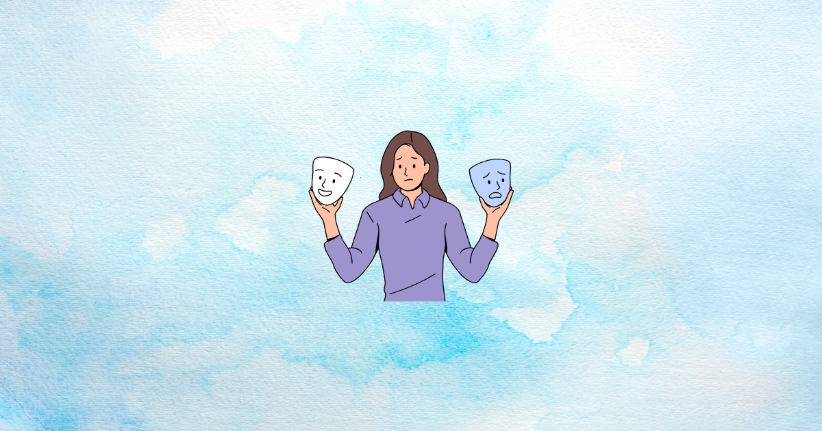
From Robot to Human
The fix is simple: make your microcopy sound like a person, not a computer.
Before and After Examples
| Robot Speak | Human Feel |
|---|---|
| “Out of stock” | “Oh no! You snatched them all. We’re restocking soon.” |
| “Item added to cart” | “Nice choice! It’s in your bag.” |
| “Invalid email address” | “Hmm, that email doesn’t look quite right” |
| “Submit” | “Let’s do this” |
| “Your cart is empty” | “Your cart is feeling lonely. Let’s fix that.” |
| “Order confirmed” | “You did it! Your order is on its way.” |
Same information. Completely different feeling.
Matching Your Brand Voice
The right tone depends on your brand. A luxury watch store shouldn’t say “Oh no!” An outdoors brand shouldn’t sound corporate.
- Fun/playful brand: “Woohoo! You’re in.”
- Luxury/premium brand: “Welcome. Your selection awaits.”
- Professional/B2B brand: “Got it. We’ll take it from here.”
- Eco-friendly brand: “Thanks for being part of the solution.”
Whatever voice you choose, be consistent. Microcopy is where many brands accidentally break character.
The High-Stakes Spots
Some microcopy locations matter more than others. These are the moments when emotions are running high and the right words can tip decisions.
Near the Credit Card Field
This is the moment of maximum anxiety. The customer is about to hand over money. Their brain is screaming “Is this safe? Will I regret this?”
Microcopy here should reassure:
- “Secure checkout—your payment info is encrypted”
- “256-bit security keeps your data safe”
- “We never share your information with anyone”
A small lock icon with a gentle security message can reduce abandonment more than a discount pop-up.
The Buy Button
“Buy Now” is fine. But it’s also generic. Consider what the customer is really doing:
- “Get My Gear” (for outdoor equipment)
- “Start My Journey” (for a course or program)
- “Send This Gift” (for gift purchases)
- “Treat Yourself” (for self-care products)
The button tells a story. “Buy Now” says “give us money.” “Start My Journey” says “begin your transformation.”
Error Messages
When something goes wrong, most sites blame the user. “Invalid input.” “Error: Form incomplete.” This creates frustration and shame.
Better approach: take responsibility, stay helpful:
- Instead of: “Invalid credit card number”
- Try: “Hmm, that card number isn’t working. Want to double-check?”
- Instead of: “Error: Required field missing”
- Try: “Oops! We need a few more details to continue”
The customer’s emotional state after an error determines whether they try again or give up.
Emotional Categories
Different microcopy serves different emotional purposes. Knowing which emotion you want to trigger helps you write better.
Urgency
Creates desire and anxiety about missing out:
- “Only 3 left!”
- “Selling fast”
- “Last one at this price”
Belonging
Creates warmth and community feeling:
- “Welcome to the family”
- “You’re one of us now”
- “Join 50,000 happy customers”
Achievement
Creates pride and positive reinforcement:
- “Great choice!”
- “Smart pick”
- “You’ve got good taste”
Relief
Creates comfort and safety:
- “All done! Nothing else to do.”
- “Your order is confirmed and on its way”
- “We’ve got you covered”
Match the emotion to the moment. Urgency when deciding. Achievement after adding to cart. Relief after checkout.
The Clarity vs. Cleverness Balance
Here’s an important warning: don’t sacrifice clarity for personality.
If your clever button label confuses people, conversions will drop. “Begin Your Transformation” might be vague for someone just trying to buy a t-shirt.
Test these guidelines:
- Buttons must be instantly clear. Someone should know exactly what happens when they click.
- Error messages must explain the problem. Personality is great, but not at the cost of understanding.
- Navigation must be obvious. Save creativity for moments that can handle ambiguity.
When in doubt, test. Run the functional version against the emotional version. Data beats opinion.
Where to Start: The Audit
You don’t have to rewrite everything at once. Start with the high-impact spots.
Must-Audit Pages
- 404 Error Page: Most stores show generic “Page not found.” This is a chance to rescue lost visitors with personality and helpful links.
- Thank You Page: The moment after purchase is emotionally open. Use it to build relationship, not just confirm order numbers.
- Empty Cart: When the cart is empty, you have their attention. Make them smile. Point them somewhere useful.
- Checkout Fields: Every hint text, every label, every error message. This is where money is won or lost.
Quick Wins
These changes take five minutes and often make measurable differences:
- Change “Subscribe” to “Join Us” (or something that matches your brand)
- Add a reassuring security note near payment info
- Rewrite your 404 page with personality
- Make error messages apologize instead of blame
Making Microcopy Dynamic
Static microcopy is better than robot speak. But dynamic microcopy—text that changes based on context—is even more powerful.
Consider the difference between showing “Welcome!” to everyone versus showing “Welcome back, Sarah!” to a returning customer. The personalized version creates connection.
Growth Suite enables this contextual approach by tracking visitor behavior and delivering tailored messages at decision points. A first-time visitor might see encouraging exploration prompts, while a returning visitor who previously abandoned checkout might see messages that address their specific hesitation. The right emotional message at the right moment makes the difference between bounce and conversion.
Testing Your Tone
Before rolling out a complete microcopy overhaul, test your assumptions.
Simple A/B Test to Run
Pick your most-clicked button (probably “Add to Cart”). Create two versions:
- Version A: Functional (“Add to Cart”)
- Version B: Emotional (something that matches your brand)
Run the test for enough traffic to reach statistical significance. See which version gets more clicks. Let data guide your decisions.
What to Measure
- Click-through rate: Are more people clicking?
- Conversion rate: Are more people completing the action?
- Exit rate: Are people leaving less often from that page?
Sometimes clever microcopy increases clicks but decreases conversions (people click out of curiosity, then get confused). Watch the full funnel.
Key Takeaways
- Microcopy is the small text everywhere — Buttons, errors, confirmations, hints, empty states
- Most stores use robot speak — Generic, cold, forgettable default text
- Human microcopy creates emotional connection — Same information, different feeling, better results
- Match your brand voice — Playful, premium, professional, eco-friendly—pick a tone and stay consistent
- Focus on high-stakes moments — Payment fields, buy buttons, and error messages matter most
- Clarity beats cleverness — Never sacrifice understanding for personality
- Test before rolling out — A/B test emotional versus functional versions
Every word on your site is an opportunity to make customers feel something. Most stores waste this opportunity with cold, generic text. Go audit your 404 page right now. Read your error messages. Check your thank you page. Make them sound like a human who cares. These tiny changes add up to big emotional shifts—and emotional shifts drive buying decisions.