
Have you ever found yourself staring at a product page, overwhelmed by the sheer amount of information, specs, and features? Or maybe you’ve abandoned a purchase because comparing different options became too much work? You’re not alone.
In today’s digital marketplace, we often assume that providing customers with more information leads to better decisions and higher sales. But what if the opposite is true? What if too much information actually hurts your conversions?
This article dives into the fascinating world of information bias – a psychological phenomenon where providing excessive product details can actually harm your conversions rather than help them. By reading this article, you’ll discover:
- Why our brains get overwhelmed with too many product details
- How information overload directly impacts your sales
- Practical ways to present information that boost rather than hinder conversions
- Real-world examples of businesses that increased sales by simplifying their product information
Ready to learn how the right amount of information can dramatically improve your conversion rates? Let’s get started!
Understanding Information Bias in Consumer Behavior
When shoppers visit your online store, they’re not coming with unlimited mental capacity to process information. Instead, they arrive with very real cognitive limitations that affect how they make decisions.
Information bias occurs when we provide so much data that customers become overwhelmed rather than informed. This isn’t just an annoyance – it has measurable impacts on behavior.
The Brain’s Processing Limits
Our brains have built-in limitations when processing information. You may have heard of Miller’s Law, which suggests that most people can only hold about 7 items (plus or minus 2) in their working memory at once. When product pages present dozens of specifications, features, and options, we’re exceeding the brain’s natural capacity.
Think about it: when you present a customer with 30 different features for a single product, you’re not helping them make a better decision – you’re forcing their brain to work harder than it’s designed to.
The Paradox of Choice
We often believe that more choices and more information lead to better decisions. However, research has consistently shown that too many options can lead to what psychologists call “choice paralysis” – where the fear of making the wrong choice leads to making no choice at all.
When your product page overwhelms visitors with information, many will simply click away rather than struggle through the decision-making process. It’s not laziness – it’s how our brains are wired to protect us from unnecessary cognitive strain.
The Economic Impact
Information overload doesn’t just frustrate customers – it directly impacts your bottom line. Research shows a clear correlation between information density and conversion rates. As the amount of information increases beyond the optimal point, conversions typically decrease.
But it doesn’t stop at lower conversion rates. Information overload can also lead to:
- Higher return rates – When customers make decisions based on too much information, they’re more likely to experience post-purchase regret
- Lower average order values – Overwhelmed customers may choose cheaper options just to simplify their decision
- Decreased customer loyalty – Difficult purchasing experiences make customers less likely to return
Now that we understand what information bias is and why it matters, let’s explore the psychological mechanisms that make too much information so problematic. Are our brains really that easily overwhelmed? (Spoiler alert: yes, they are!)
The Psychology Behind Information Overload
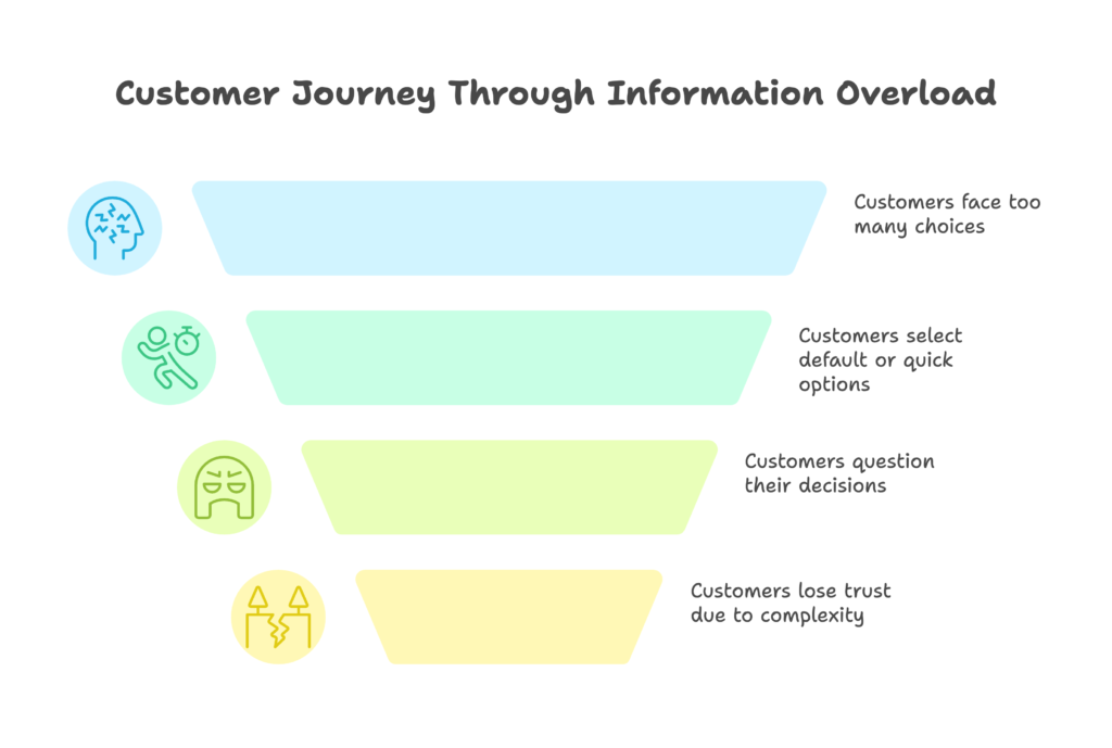
When your customers face too much information, several psychological mechanisms kick in that directly impact their ability to make decisions. Understanding these mechanisms can help you design better product pages that work with – not against – how the human mind operates.
Decision Fatigue: The Hidden Conversion Killer
Every decision we make throughout the day depletes our mental energy. This phenomenon, known as decision fatigue, means that the more choices we have to make, the worse our decisions become over time.
When your product page forces customers to evaluate and compare numerous features, specifications, and options, you’re accelerating their decision fatigue. The result? Many will:
- Choose the default option (even if it’s not the best fit for them)
- Make impulsive decisions just to complete the process
- Abandon the purchase entirely to avoid the mental effort
Think about the last time you bought a complex product like a laptop or insurance plan. Did you actually read and compare every single specification? Or did you eventually just pick something that seemed “good enough” to end the mental strain?
Cognitive Dissonance and Post-Purchase Regret
Too much information doesn’t just affect the initial purchase decision – it can lead to increased post-purchase regret. When customers have to process excessive information, they’re more likely to experience cognitive dissonance after buying.
This happens because with so many features and options to consider, customers can’t help but wonder if they made the optimal choice. Did they pick the right size, color, or model? Should they have paid extra for that additional feature? This uncertainty can lead to:
- Higher return rates
- Negative reviews (even for good products)
- Customer service inquiries about features they didn’t fully understand
Trust Erosion: When Complexity Signals Deception
Here’s something that might surprise you: presenting too much technical information can actually decrease trust in your product. When product pages are overloaded with technical jargon, specifications, and complex feature descriptions, many customers interpret this as:
- An attempt to confuse them
- A way to hide potential drawbacks
- A sign that the product is overly complicated to use
Simplicity, on the other hand, often signals confidence and transparency.
We’ve seen how too much information affects the psychology of decision-making. But how do you know if your product pages have crossed the line from helpful to overwhelming? Next, let’s look at how to measure and diagnose information overload on your site.
Measuring Information Overload on Your Website
Before you can optimize your product information, you need to know if and where information overload is happening on your site. Here are practical ways to diagnose this common conversion killer.
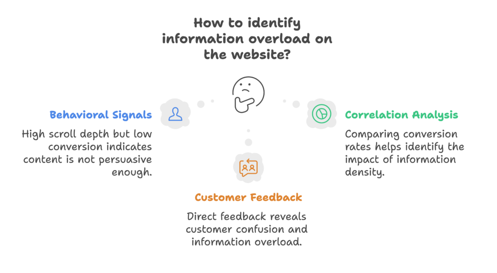
Behavioral Signals of Information Overload
Your customers’ behavior on your site provides valuable clues about information overload. Look for these warning signs:
- High scroll depth but low conversion – People are reading all your content but not taking action
- Abandonment during comparison – Visitors leave after using product comparison tools
- Multiple sessions before purchase – Customers need to return several times to process all the information
- High exit rates on specification sections – People leave after viewing detailed product specs
These behaviors suggest that visitors are getting stuck in “research mode” rather than moving to “buying mode” – a classic symptom of information overload.
Correlation Analysis: Connect the Dots
To more precisely diagnose information overload, examine the relationship between information density and conversions:
- Compare conversion rates between simpler and more complex product pages
- Test different levels of initial information disclosure (with optional expansion for details)
- Analyze how engagement with technical specifications correlates with purchases
For example, if products with fewer visible specifications convert better than those with comprehensive technical details, you likely have an information overload problem.
Direct Customer Feedback
Sometimes the best approach is simply to ask your customers. Consider:
- Post-purchase surveys asking about the decision process
- User testing sessions where you observe how people interact with product information
- Analyzing customer service inquiries for signs of confusion
Listen for comments like “It was confusing to choose” or “There was too much to consider” – these directly indicate information overload.
Now that you know how to identify information overload, let’s explore practical strategies to optimize your product information for better conversions. How can you provide the right information, at the right time, in the right way?
Strategic Information Optimization: Less Can Be More
The goal isn’t to eliminate product information – it’s to present it in ways that help rather than hinder decision-making. Let’s explore practical strategies to optimize how you present product information.
Progressive Disclosure: Reveal Information in Layers
Instead of showing all information at once, progressive disclosure presents basic information first, with options to view more details if desired. This approach:
- Reduces initial cognitive load
- Lets customers control how much information they consume
- Prioritizes the most important details
Implementation ideas include:
- Expandable sections for technical specifications
- “Learn more” links that reveal additional details
- Tabs that organize different types of information
This approach is particularly effective on mobile devices, where screen space is limited and information overload happens even more quickly.
Cognitive Chunking: Group Related Information
Our brains process information better when it’s organized into meaningful groups or “chunks.” Instead of presenting a long list of specifications, consider:
- Grouping features by use case or benefit (e.g., “Perfect for Photography” vs. “Great for Gaming”)
- Using visual organization like icons, colors, or boxes to separate different types of information
- Creating comparison matrices that align similar features across products
This approach reduces cognitive load while still providing comprehensive information for those who want it.
Benefit-Driven Presentation: The “So What?” Test
One of the most powerful ways to combat information overload is to focus on benefits rather than specifications. For each feature you list, ask: “So what? Why does the customer care about this?”
For example, instead of listing “256GB SSD storage,” you might say “Store up to 100,000 photos without slowing down.” This approach:
- Makes technical information more meaningful
- Helps customers understand why features matter to them
- Reduces the mental effort needed to process specifications
When you translate features into benefits, you’re doing the cognitive work for your customers – making their decision process much easier.
These strategies sound great in theory, but do they actually work in practice? Next, let’s look at real-world examples of businesses that transformed their conversion rates by optimizing their product information.
Real-World Success Stories: When Less Information Led to More Sales
The proof is in the results. Let’s look at how real businesses have successfully tackled information overload and boosted their conversions as a result.
Consumer Electronics: From Spec Sheets to Sales
A major electronics retailer was struggling with low conversion rates on their smartphone category pages. Their original approach featured comprehensive specification lists for each device – processors, RAM, screen resolution, and dozens of other technical details.
Their solution? They implemented a layered approach to information:
- First layer: Key benefits and top 3-5 features most customers cared about
- Second layer: Expandable sections for more detailed specifications
- Third layer: Downloadable complete specification sheets for technical users
The results were impressive: a 38% increase in conversion rate and a decrease in returns. By prioritizing the most relevant information, they made decision-making easier while still providing complete details for those who wanted them.
SaaS Platform: Simplifying the Complex
A software-as-a-service company offering a complex project management tool found that their feature-heavy landing pages were underperforming. Visitors were getting lost in the extensive feature lists and technical capabilities.
Their approach to solving information overload included:
- Replacing feature lists with use-case scenarios
- Creating user-specific views (“For Developers” vs. “For Managers”)
- Implementing interactive demonstrations instead of feature descriptions
After these changes, not only did sign-ups increase by 24%, but new users were more likely to successfully onboard and remain active, increasing lifetime value significantly.
Luxury Products: The Power of Simplicity
A luxury watch brand discovered an interesting pattern: their entry-level watches with detailed technical specifications had lower conversion rates than their high-end watches with minimal, elegantly presented information.
When they revised their product pages to focus on craftsmanship, heritage, and emotional benefits – while making technical details available but secondary – they saw:
- Increased time on page
- Higher conversion rates
- Increased average order value
This case illustrates an important principle: sometimes what sells a product isn’t comprehensive information, but the right information presented in the right way.
These success stories show that optimizing product information isn’t just theoretical – it delivers real results. But how do you actually implement these principles on your e-commerce site? Let’s dive into practical implementation steps.
Implementation Blueprint for Your E-Commerce Store
Now comes the practical part: how do you actually implement information optimization on your own e-commerce store? Let’s break down the steps.
Product Page Optimization
Your product pages are where information overload most commonly occurs. Here’s how to optimize them:
- Above-the-fold essentials: Include only the most crucial information initially visible:
- Product name and high-quality images
- Brief, benefit-focused description (not features)
- Price and primary call-to-action
- 1-3 key differentiating features
- Implement accordion systems for additional information:
- Technical specifications
- Detailed dimensions
- Materials and care instructions
- Use benefit-driven labeling for features:
- Instead of “12MP Camera,” try “Professional-quality photos even in low light”
- Instead of “Gore-Tex Material,” try “Stay dry in any weather condition”
Remember: Your goal is to provide the right information at the right time, not to eliminate information entirely.
Checkout Process Simplification
Information overload doesn’t just affect product pages – it can make your checkout process unnecessarily complicated too:
- Minimize form fields – only ask for essential information
- Use progressive disclosure for optional fields and special instructions
- Provide context-sensitive help only when needed (e.g., small question marks that reveal information when clicked)
- Eliminate distractions – consider a focused checkout with minimal navigation options
A streamlined checkout process not only reduces cognitive load but also minimizes abandonment at this critical conversion point.
Post-Purchase Reinforcement
Information optimization shouldn’t end at the purchase. To reduce post-purchase regret and returns:
- Send confirmation emails that reinforce the benefits of their purchase
- Provide just-in-time education about product features as they become relevant
- Create easy-to-access support resources for common questions
- Encourage community knowledge sharing among customers
This approach ensures customers feel confident about their purchase and know how to get the most value from your products.
As you optimize your information presentation, it’s important to maintain ethical standards. Let’s consider how to balance simplification with transparency and honesty.
Balancing Simplicity and Transparency: The Ethical Dimension
While optimizing information for better conversions is important, it must be done ethically. The goal is to help customers make better decisions, not to manipulate or deceive them.
Transparency Requirements
As you simplify information, ensure you’re still providing all necessary details for informed decisions:
- Essential information should always be readily accessible
- Critical limitations or requirements should never be hidden
- Industry-specific regulations about disclosure must be followed
The test is simple: Would a reasonable customer feel they had all the information they needed to make a good decision?
Supporting Vulnerable Users
Not all users have the same level of familiarity with your products or technical knowledge:
- Provide additional guidance for novice users
- Include clear explanations of technical terms
- Offer extra support for high-value or complex purchases
This inclusive approach ensures all users can navigate your information effectively, regardless of their expertise level.
Cultural Considerations
Information preferences vary across cultures and regions:
- Some markets may expect more detailed technical information
- Visual presentation may need adjustment for different cultural contexts
- Translation should consider cultural norms around information presentation
Testing your information presentation with diverse user groups can help ensure it works across different contexts.
We’ve covered a lot of ground in understanding and addressing information bias. But what does the future hold for information design in e-commerce? Let’s peek at emerging technologies and approaches.
The Future of E-Commerce Information Design
The field of information design continues to evolve rapidly. Here are some exciting developments that will shape how we present product information in the coming years.
Emerging Technologies
New technologies are creating opportunities for more intuitive information presentation:
- Augmented reality (AR) for product visualization – allowing customers to “see” products in their environment rather than read about dimensions
- AI-powered personalization – automatically adjusting information density based on user behavior
- Voice interfaces – enabling conversational exploration of product features
These technologies promise to reduce cognitive load by making information more intuitive and contextual.
Predictive Systems
The future of information design will likely be predictive rather than reactive:
- Systems that anticipate customer questions before they arise
- Real-time complexity adjustment based on user engagement signals
- Cross-platform consistency in information presentation
These approaches will help ensure customers get exactly the information they need when they need it.
Evolving Best Practices
The field of information design is developing new frameworks for effectiveness:
- Cross-cultural cognitive load research for global markets
- New metrics for measuring information effectiveness
- Ethical guidelines for information presentation
Staying current with these developments will help you maintain competitive advantage in information presentation.
Conclusion: Finding the Information Sweet Spot
We’ve explored how information bias affects consumer behavior and how too much product information can actually harm your conversions rather than help them. The key takeaways from this article are:
- Our brains have real limitations in processing information, and exceeding these limits leads to decision fatigue and abandoned purchases
- Strategic information presentation – using progressive disclosure, cognitive chunking, and benefit-focused descriptions – can dramatically improve conversion rates
- Real businesses across different industries have seen significant improvements by optimizing their product information
- Implementation requires thoughtful design of product pages, checkout processes, and post-purchase communication
- Balancing simplicity with transparency ensures an ethical approach to information optimization
The goal isn’t to provide less information – it’s to present information in a way that works with how our brains naturally process it. When you find this sweet spot, both you and your customers win: they make confident decisions without unnecessary cognitive strain, and you enjoy higher conversion rates and customer satisfaction.
Looking to optimize your Shopify store’s product information and boost conversions? Growth Suite can help you implement these strategies and more. With smart product page optimization and data-driven insights, you can find your perfect information balance and watch your sales grow.
References
- Growcode. (2023). Too Many Options Harm Conversions
- Convertize. (2025). Cognitive Biases in CRO
- AB Tasty. (2024). CRO Guide
- The Good. (2021). Cognitive Load Theory
- OptiMonk. (2024). High-Converting Product Pages
- Convertcart. (2022). Reducing Cognitive Load
- PMC. (2016). Neural Basis of Decision Fatigue