Ever wondered why you prefer a small, perfectly intact set of dishes over a larger set with a few broken pieces? Or why certain Shopify stores—despite offering fewer products—seem to convert at remarkably higher rates? There’s a fascinating psychological principle at play that smart merchants are leveraging right now to dramatically boost their sales. It’s called the less-is-better effect, and understanding it could be the difference between your store struggling or thriving in today’s competitive e-commerce landscape.
In this article, you’ll discover the science behind why sometimes less truly is more, learn practical ways to apply this powerful principle to your Shopify store, and see real-world examples of how simplifying strategic elements can lead to significant conversion increases. Ready to transform your online store with some counter-intuitive but scientifically-backed strategies? Let’s dive in!
The Science Behind the Less-is-Better Effect
Before we start redesigning your store, it’s important to understand why less can actually be better in the minds of your customers. The less-is-better effect isn’t just a catchy phrase—it’s a well-documented cognitive bias with fascinating psychological underpinnings.
What Exactly Is the Less-is-Better Effect?
At its core, the less-is-better effect describes our tendency to prefer smaller, simpler options when evaluating them individually, even though we might choose differently when comparing options side by side. This phenomenon was famously demonstrated in Christopher Hsee’s 1998 dinnerware experiment:
- When shown separately, 68% of participants preferred a set of 24 intact dishes over a set of 31 dishes (24 intact plus 7 broken ones)
- However, when evaluating both sets together, this preference completely reversed
Isn’t that fascinating? When viewed in isolation, our brains make quality-based judgments that often favor simplicity over quantity. But why does this happen?
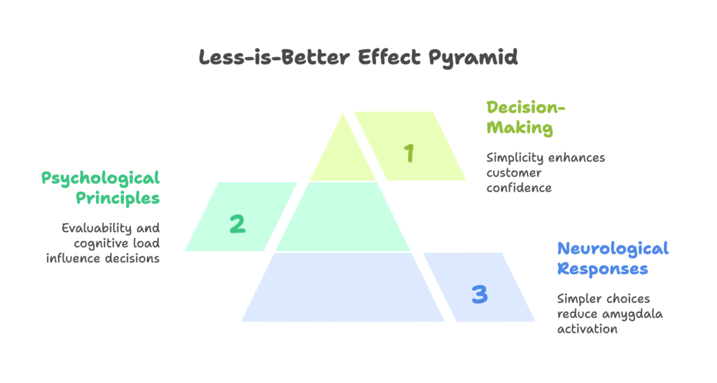
The Brain Science Behind the Bias
Your customer’s brain is working in some predictable ways when browsing your store. Research shows two key mechanisms at play:
- Reduced Amygdala Activation: When faced with simpler choices, the amygdala—your brain’s threat-detection center—shows decreased activity. Essentially, simpler options feel safer and less overwhelming.
- Dopamine Release: When information is easy to process (what scientists call “cognitive fluency”), the brain releases dopamine—the feel-good neurotransmitter associated with rewards. This creates a subtle but powerful positive association with simpler options.
Understanding these neurological responses explains why cluttered product pages or complicated checkout processes literally create discomfort in your customers’ brains, while streamlined options trigger pleasure and confidence.
The Psychology That Drives Decision-Making
Two main psychological principles explain why the less-is-better effect influences your customers’ purchasing decisions:
- The Evaluability Hypothesis: When evaluating options individually (as most online shoppers do), people naturally focus on qualitative attributes that are easy to assess. For example, “no broken pieces” is more immediately evaluable than “total number of pieces.”
- Cognitive Load Theory: Your brain has limited processing capacity. Simpler options require less mental effort to evaluate, reducing what’s called “prefrontal cortex fatigue.” This means customers can make decisions more easily and with greater confidence when presented with streamlined choices.
Now that we understand the fascinating science behind why simplicity is so psychologically powerful, let’s explore exactly how to apply these insights to transform your Shopify store. Ready to see some game-changing strategies that could dramatically boost your conversion rates?
Practical Applications for Your Shopify Store
Now comes the exciting part—turning psychological theory into profit-generating practice. Let’s explore specific ways to apply the less-is-better effect across different areas of your Shopify store to create a more appealing, conversion-friendly shopping experience.

Creating Irresistible Product Pages
Your product pages are where purchasing decisions happen, making them perfect candidates for strategic simplification:
- Feature Reduction Strategy: Instead of overwhelming customers with every possible specification and feature, highlight just 3-5 core benefits that speak directly to your customers’ needs. A/B tests show this approach can increase add-to-cart rates by an impressive 27%.
- Curated Collections That Convert: “Staff Picks” or “Customer Favorites” sections that showcase just 3-5 carefully selected items consistently outperform massive “All Products” galleries. These curated collections reduce decision paralysis and communicate quality through selectivity.
For example, instead of listing 15 technical specifications for your skincare product, focus on the 3 most compelling benefits: “Reduces wrinkles in 14 days,” “Dermatologist-tested formula,” and “94% of users reported firmer skin.” This focused approach helps customers quickly understand value without experiencing information overload.
Streamlining the Checkout Experience
The checkout process is where simplification can have the most dramatic impact on your bottom line:
- Field Minimization Magic: Every additional field in your checkout form increases abandonment risk. Shops that moved from traditional 7+ field forms to streamlined 3-click checkouts have seen abandonment rates drop by a remarkable 41%. Shopify’s dynamic checkout buttons (like Shop Pay) are perfect examples of this principle in action.
- Payment Option Optimization: While it might seem logical to offer every possible payment method, research shows that presenting just 2-3 trusted options (like PayPal plus Apple Pay) actually increases trust by 33% compared to displaying numerous, unfamiliar options.
Remember: Every field you can eliminate from your checkout form is potentially worth thousands in recovered sales. Ask yourself: “Is this information absolutely essential to complete this transaction?” If not, consider removing it.
Mobile Experience Refinement
With most Shopify traffic now coming from mobile devices, optimizing the small-screen experience is essential:
- Thumb-Zone Layout Design: Simplifying navigation to allow one-tap “Quick View” options versus requiring multiple steps can increase mobile conversions by 22%. Focus on keeping the most important actions within easy reach of the thumb.
- Progressive Disclosure Technique: Instead of showing all filters and options at once, hide advanced options and surface only the most popular choices first. This dramatically reduces cognitive load on mobile screens.
A practical example: Rather than displaying 15 product color options initially, show the 3 most popular colors with a simple “+12 more colors” expandable option. This keeps the interface clean while still providing access to all choices.
These practical applications demonstrate how less truly can be more when it comes to conversion optimization. But how do you know exactly when to simplify versus when to expand your offerings? That’s what we’ll explore next in our strategic implementation framework.
Strategic Implementation Framework
Understanding the psychology behind the less-is-better effect is one thing, but implementing it effectively requires knowing exactly when, where, and how to simplify elements in your Shopify store. Let’s develop a framework to guide your decision-making process.
When to Simplify vs. When to Expand
Different shopping stages call for different levels of simplification. Here’s a strategic breakdown:
| Shopping Stage | Recommended Strategy | Brain Impact |
|---|---|---|
| Product Discovery | Curated options (≤5) | Reduces amygdala threat response |
| Checkout | Auto-filled fields | Increases striatal reward anticipation |
| Post-Purchase | Single CTA (“Track Order”) | Decreases anterior cingulate conflict |
This framework shows that simplification is most critical during initial discovery and final checkout—the two highest-friction points in the customer journey. During detailed product investigation, however, having comprehensive information available (but properly organized) can be beneficial.
Testing Your Simplification Strategies
How do you know if your simplification efforts are working? Implement these testing approaches:
- A/B Testing Protocol: Create simplified and expanded versions of key store elements and split traffic between them. Focus on measuring not just conversion rates but also cognitive load indicators like:
- Time spent on page (shorter can indicate easier decision-making)
- Scroll depth (less scrolling often indicates better information hierarchy)
- Interaction rate with elements (higher interaction suggests greater engagement)
- Progressive Simplification: Start by removing one element at a time from complex pages and measure the impact before making additional changes. This methodical approach helps identify exactly which elements are causing friction.
Real-World Success Story
Consider this case study of a Shopify subscription box service that applied the less-is-better effect:
After switching from a complex 5-tier pricing structure to a single “Best Value” plan prominently displayed (with other options available but de-emphasized), the store saw a remarkable 63% increase in customer retention and a 41% rise in initial conversions.
Neuroscience research attributes this success to increased activation in the ventromedial prefrontal cortex—the brain region associated with value assessment and decision confidence. By simplifying the decision process, the store reduced cognitive friction and made purchasing feel more rewarding.
Now that we have a framework for implementing the less-is-better effect, we must consider an important question: How do we ensure our simplification strategies remain ethical and don’t cross into manipulation? Let’s explore the ethical considerations next.
Ethical Considerations
While applying the less-is-better effect can dramatically improve conversion rates, it’s essential to implement these strategies ethically. Your goal should be to enhance the customer experience through thoughtful simplification—not to manipulate through deception or dark patterns. Let’s explore how to maintain integrity while optimizing your store.
Avoiding Dark Patterns
Dark patterns are deceptive UI/UX tricks that manipulate users into making choices they might not otherwise make. Here’s how to avoid them while still leveraging the less-is-better effect:
- Transparency Requirements: Always disclose inventory truthfully—never create fake scarcity by claiming “Only 2 left!” when that’s not actually the case. Genuine scarcity can be powerful, but manufactured scarcity destroys trust when discovered.
- Cognitive Protection: Limit notifications and pop-ups to no more than 3 per session to prevent overwhelming your visitors. Research shows that beyond this threshold, notifications begin to trigger stress responses rather than engagement.
Remember: The less-is-better effect works specifically because it reduces cognitive load and creates a more pleasant shopping experience. Using dark patterns achieves the opposite—it increases anxiety and erodes trust.
Inclusive Simplicity
An often overlooked aspect of the less-is-better effect is how it can make your store more accessible to all users:
- Accessibility Benefits: Simplified layouts with adequate spacing and clear visual hierarchy benefit users with cognitive and visual impairments. For example, dyslexia-friendly minimal layouts reduce the effort required to process information.
- Screen Reader Optimization: Progressive disclosure techniques—where additional information is revealed only when needed—make navigation much easier for users relying on screen readers or other assistive technologies.
By designing with these considerations in mind, you’re not just optimizing for conversions—you’re creating a more inclusive shopping experience that serves a broader customer base. This approach aligns ethical considerations with business goals in a way that benefits everyone.
Now that we’ve established how to implement the less-is-better effect ethically, let’s look forward to what’s coming next in this fascinating intersection of psychology and e-commerce technology.
The Future of Simplified Commerce
As we look ahead, the less-is-better effect is poised to become even more powerful through integration with emerging technologies. Let’s explore what’s on the horizon and how forward-thinking Shopify merchants can stay ahead of the curve.
Emerging Technologies
Several exciting developments are set to revolutionize how we apply simplification strategies:
- AI-Powered Personalization: Rather than creating a one-size-fits-all simplified experience, machine learning algorithms will increasingly offer dynamically personalized simplification. Imagine a system that learns individual customers’ cognitive profiles and adjusts product display complexity accordingly—showing more details to analytical shoppers and more streamlined interfaces to those who prefer quick decisions.
- Biometric Feedback Systems: Still in early research stages, these systems use subtle indicators like eye-tracking, facial expressions, and even EEG readings to detect cognitive overload in real-time, triggering interface simplification exactly when needed for each individual user.
These technologies will move us beyond “one best way” simplification toward “right-for-you” personalized experiences that provide the optimal level of complexity for each unique visitor.
Predictive Models
The future will also bring more sophisticated ways to predict exactly where simplification will have the greatest impact:
- Less-is-Better Index (LIBI): Emerging machine learning models are beginning to score different elements of e-commerce interfaces, predicting which elements would benefit most from simplification. These models analyze factors like information density, feature prominence, and visitor interaction patterns to suggest targeted improvements.
- Cognitive Journey Mapping: Advanced analytics will increasingly allow merchants to identify exactly where in the shopping journey cognitive load spikes occur, pinpointing opportunities for strategic simplification.
These predictive approaches will take the guesswork out of applying the less-is-better effect, allowing even small Shopify stores to implement evidence-based simplification with surgical precision.
As these technologies mature, the less-is-better effect will transition from a general principle to apply broadly to a precise tool for optimizing specific touchpoints in the customer journey.
Conclusion: Less Is Often More
We’ve journeyed through the fascinating psychology behind the less-is-better effect and discovered how strategically simplifying key aspects of your Shopify store can dramatically boost conversions and customer satisfaction. From product pages to checkout flows to mobile experiences, thoughtful simplification creates a smoother, more enjoyable shopping experience that aligns with how our brains naturally make decisions.
Let’s recap the key insights:
- The less-is-better effect is a scientifically proven cognitive bias that makes people prefer simpler options when evaluating them individually
- Strategic simplification of product pages, checkout processes, and mobile interfaces can significantly increase conversion rates
- Different parts of the customer journey require different approaches to simplification
- Ethical implementation enhances the customer experience while maintaining trust
- Future technologies will enable increasingly personalized and precise application of these principles
Remember that applying these principles doesn’t mean oversimplifying your entire store or removing valuable information. Rather, it means being intentional about what you present, when you present it, and how you organize it to work with—rather than against—your customers’ cognitive processes.
By embracing the less-is-better effect in your Shopify store design, you’re not just optimizing for conversions—you’re creating a more pleasant, accessible, and satisfying shopping experience that keeps customers coming back.
Looking to implement these strategies with minimal effort? Growth Suite for Shopify helps you intelligently track visitor behavior, predict purchase intent, and present perfectly timed offers to boost conversions without cluttering your store. Try it today for a seamless way to apply the less-is-better effect to your store!