Have you ever wondered why a simple shift from blue to red can instantly change how you feel about a website or a product? Or why certain color combinations grab your attention more than others? By reading this post, you will learn how color goes way beyond personal preference and becomes an essential force shaping our emotions and actions. Ready to discover how your brain transforms wavelengths of light into vivid experiences that guide your behavior? Let’s dive in and explore a world where color is more than just a visual detail—it’s a key to understanding how we think, feel, and make decisions.
In this opening section, we will examine color as a neural event rather than just a physical phenomenon, learn about the fascinating history of color neuroscience, and see why understanding color’s neurological impact matters for everyone. By the end, you’ll be primed and excited for the deeper exploration ahead. Once we’re done here, we’ll move on to the nuts and bolts of how our eyes and brain work together to create vibrant color experiences!
Color as a Neural Construct Rather Than Physical Property
Color is not just about light hitting your eyes; it is actually created by your brain. Physical light contains different wavelengths, but our experience of color comes from how our neurons interpret those wavelengths. In other words, what we see as “red” or “blue” depends on neural signals in the visual system, not just the properties of the light itself.
Understanding this distinction helps us appreciate why color can be so powerful. Our perception of color is uniquely shaped by our biology, allowing us to respond emotionally, cognitively, and behaviorally to the world around us. Pretty fascinating, right?
Now that you see color as a dynamic interaction between eyes and brain, it’s time to learn how we discovered these insights. Let’s head into the past and see how color neuroscience evolved to its present form.
Historical Context of Color Neuroscience
Early thinkers believed color was purely physical—just light bouncing off objects. Over time, scientists realized that color is deeply tied to brain processes. As research tools improved, we mapped how specific brain regions respond to certain wavelengths and how these responses shape our experience of color.
Key breakthroughs involved identifying the distinct pathways and areas in the brain responsible for interpreting color, such as the primary visual cortex (V1) and higher visual areas. These milestones shifted our understanding from a basic “light-in, color-out” perspective to a richer model of color as an integral part of human perception.
We’ve traveled from basic theories to complex neurology. But why does this matter in our everyday lives? Let’s find out in the next section.
The Significance of Understanding Color’s Neurological Impact
Color influences us in ways that go well beyond aesthetics. From driving purchase decisions in marketing to affecting mood in therapeutic contexts, color has far-reaching consequences. Knowing how your brain handles color can help designers, advertisers, and even healthcare professionals create more effective and beneficial environments.
This research also crosses boundaries—neuroscientists, psychologists, and marketers often collaborate to uncover how color shapes human thought and behavior. By uncovering how our brains process color, we gain insights into how to harness it responsibly for various practical applications.
Now that you understand why color’s neural impact is so significant, let’s explore the actual building blocks of this process. Ready to discover how color signals travel from your retina to your brain? Let’s go!
Fundamentals of Neural Color Processing
In this section, we will look at the earliest steps in color perception—from the tiny cones in your retina to the complex pathways that carry color data into your brain. We will also explore how different brain areas transform these signals into the colorful world you see. Stick around to learn how an apparently random distribution of cone receptors still results in consistent color perception for most people. Then we’ll dig deeper into how these signals evolve on their journey through the visual cortex.
The Retinal Foundation
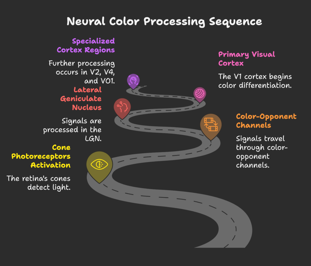
Your retina contains three types of cone photoreceptors often referred to as S (short), M (medium), and L (long) cones. Each type is sensitive to a specific range of wavelengths—think of them as three “teams” working together to capture different parts of the light spectrum. Surprisingly, the proportions of these cones can differ among individuals, yet most people still experience a similar range of colors.
These cones are scattered in a mosaic-like pattern that appears random at first glance. However, this arrangement is incredibly efficient at capturing light under a variety of conditions. Even with differences in cone distribution, our brains compensate so we perceive a consistent color world.
Now that you see how the retina sets the stage, let’s follow these signals deeper into the brain to understand how they get processed next.
From Eye to Brain: Pathways of Color Information
Once color signals leave the retina, they travel through specialized “color-opponent” channels, typically referred to as black-white, red-green, and blue-yellow pathways. These channels simplify complex visual data, allowing the brain to handle contrasts like brightness and hue more efficiently.
These signals then pass through the lateral geniculate nucleus (LGN) in the thalamus before heading to the visual cortex. As color information moves forward, it undergoes transformations that prepare it for higher-level recognition. By the time these signals reach the cortex, they’re more than just wavelengths—they’re on the verge of becoming the rich colors you consciously perceive.
So we have these color signals traveling through their unique routes. Next, we’ll see how the cortex fine-tunes them into the colorful experience we know and love.
The Cortical Machinery of Color Vision
In the primary visual cortex (V1), color information first arrives in a rather raw form. Here, the brain begins to differentiate colors and edges, laying down the basics. After V1, regions like V2, V4, and VO1 specialize further. Research using MEG and fMRI shows distinct patterns of brain activity when you see specific colors, which means each color has its own unique “footprint” in the cortex.
At this point, your brain transitions from dealing with light wavelengths to creating your personal experience of color. In other words, the neural coding moves beyond simple physical inputs to form your subjective sense of “red,” “blue,” or any hue in between.
We’ve seen the path color signals take. Now it’s time to look at how the brain categorizes these colors and distinguishes between what’s physically there and what we actually perceive. Shall we continue?
Neural Mechanisms of Color Categorization and Processing
Here, we’ll explore how our brains decide where one color ends and the next begins, and how the neural system can detect color even when physical clues are minimal. We’ll also see how color interacts with other visual features like shape and motion. Get ready to uncover how complex your color experience really is!
Specialized Color Processing Networks
Certain brain areas, especially V4 and VO1, are strongly linked to conscious color perception. These regions form networks that work together to group and categorize colors in our environment. Think of them as your personal color palette managers.
Researchers have also identified “neural maps” of color perception, meaning our brains organize hues along dimensions like red-green or blue-yellow. This organization helps us quickly recognize and distinguish different colors, even when new lighting conditions or background colors shift our perception.
So these specialized networks create the foundation for color categorization, but what happens when physical color cues clash with what we think we see? Let’s explore that next.
Dissociating Stimulus Chromaticity from Perceptual Experience
“Switch rivalry” experiments have shown that the color you think you see can differ from the actual wavelength information coming in. In these studies, people sometimes perceive color even without the expected retinal stimulation—or fail to see color when it’s actually there.
This phenomenon highlights the role of higher visual areas in constructing color experience. Early visual areas respond primarily to the presence of certain wavelengths, whereas areas like V4 focus on whether you experience “blue” or “green.” This hierarchical structure shows how your brain can “override” raw signals based on context and neural processing.
Now that we’ve separated what’s out there from what we perceive, let’s look at how color interacts with form, motion, and depth in the next sub-section.
Integration of Color with Other Visual Attributes
Color doesn’t act alone. Our brain processes it alongside other features—like shape, depth, and motion—in overlapping neural compartments. When you see a red ball rolling, your brain is integrating color (red), shape (round), and motion (rolling) all at once.
There used to be a myth that color processing was isolated, but modern research shows extensive cross-talk between different visual attributes. This integrated approach helps you interpret complex scenes in milliseconds, allowing for smooth and continuous interaction with your environment.
Ready to see how all this complex color processing translates into real-life behavior and choices? Let’s keep going!
The Neurological Basis of Color-Induced Behavior
Now, we’ll link color perception to actual behaviors and emotional responses. We’ll explore how the brain’s reward and emotional circuits react to different hues, how color impacts attention and memory, and why some colors trigger faster reaction times. By the end, you’ll see why color is never just about looks—it’s about action.
Color and Emotional Processing
Different colors activate emotional responses in the brain. Warm colors like red and orange can trigger excitement, possibly by engaging the limbic system and increasing dopamine release. Cool hues like blue often have a calming effect, which may reduce stress levels.
These color-emotion links are not only psychological but also biological. Emotional processing centers in the brain respond automatically to color, linking your visual experience with memory, mood, and sometimes even physiological changes like heart rate.
Now that you see how color stirs emotions, let’s see how it shapes attention, cognition, and decision-making.
Attention and Cognitive Effects
Have you noticed how certain colors stand out more than others? Studies show that color can guide what you pay attention to. For example, a bright red sign may pop out immediately, allowing you to react faster.
- Processing speed can vary by color. Red often speeds up detection, while cooler hues can encourage deeper focus and calm thinking.
- Color also affects memory. Notes written in certain colors may be easier to recall.
By influencing attention and memory, color can shape your cognitive load and even your choices. Curious about how this translates to actual physical responses, such as reaction times? Let’s check it out next.
Response Times and Behavioral Activation
It turns out that certain colors can literally make us move faster. Research finds that a red visual cue can boost response times by around 12% compared to green. Neurologically, this happens because the pathways that process visual signals connect with motor planning areas in the brain.
This phenomenon is why some safety signals and user interface designs rely heavily on reds, oranges, or other vibrant hues to catch your eye and prompt immediate action. The brain’s visual and motor systems work hand in hand to turn color into quick behavior.
We’ve explored how color affects behavior. Next, let’s see what happens in the brain when we switch from warm to cool colors and how those differences can lead to different states of mind.
Warm vs. Cool Colors: Neurological Distinctions
Here, we’ll zoom in on how specific color “temperatures” can have unique neural effects. Ever wonder why warm shades feel energizing while cool colors seem soothing? Let’s dig into the brain activity patterns, emotional states, and behavioral tendencies connected with each family of colors.
Neural Activation Patterns
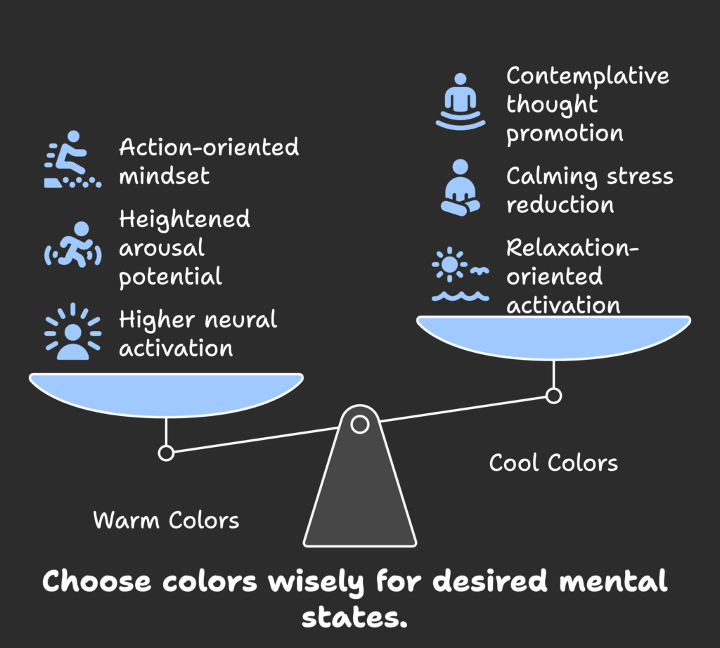
Warm colors like red, yellow, and orange often trigger higher levels of activation in the brain, including regions linked to alertness and motivation. Cool colors—blue, green, and purple—tend to activate neural networks associated with relaxation.
Interestingly, some studies suggest frontal lobe asymmetry in color processing, where certain regions light up more depending on the color temperature. This indicates that color can even influence approach (warm colors) or avoidance (cool colors) behaviors.
So we see different “brain signatures” for warm and cool hues. Now, let’s see how these might affect our energy levels and stress.
Arousal and Calming Effects
Warm colors have been linked to heightened arousal, which can energize us or raise stress, depending on the context. Meanwhile, blues and greens are often associated with calmness and may help reduce stress markers.
That’s why many therapeutic or nature-inspired designs include plenty of green and blue elements. These colors can engage natural calming responses, making them beneficial for stress management in hospitals, offices, or even our own homes.
Feeling inspired to use different colors for different mental states? Wait until you hear how warm and cool colors connect to action and thought processes in the next part.
Action-Oriented vs. Contemplative Neural Responses
Warm colors often spark an action-oriented mindset in the brain. Red tones can prompt us to move faster, take bold steps, and make quick decisions. On the flip side, cool colors like blue or purple tend to encourage more reflective thought, promoting focus and deeper concentration.
This contrast is why you might see red “Buy Now” buttons on websites—they grab attention and encourage immediate action—while calming blues are used in reading apps or study environments to maintain focus.
Now that we’ve distinguished warm and cool color effects, let’s see how individual differences and context can further shape these experiences.
Individual and Contextual Differences in Neural Color Processing
In this section, we’ll explore why color perception is not one-size-fits-all. Genetics, culture, and the immediate environment can all play a role in how your brain interprets and reacts to color. By understanding these variations, we can better tailor color use in marketing, design, and beyond.
Genetic and Physiological Factors
Certain aspects of color vision are linked to the X-chromosome, explaining why more men than women are affected by color deficiencies. As we age, our lens and neural responses also change, slightly shifting how we see colors.
Despite these variations, the brain often adapts to maintain stable color perception. Even those with color-deficient vision can interpret colors in ways that are meaningful to them, thanks to neural compensation.
So biology sets the stage, but culture and personal experiences can also leave a big mark on how we process color. Let’s find out more.
Cultural and Experiential Influences
Cultures can “teach” our brains to assign specific meanings to certain colors. For instance, white in some cultures symbolizes purity, while in others it could be linked to mourning. Past experiences further shape neural pathways, making us anticipate or recall certain feelings whenever we see a particular hue.
Over time, these conditioned responses become deeply rooted in our brains. Even traffic lights demonstrate this principle: a red light universally means “stop,” while green signals “go,” showing how cultural consensus can strongly wire our neural responses.
But it’s not just who we are—it’s also where we are. Let’s look at how immediate surroundings and lighting shape color perception next.
Context-Dependent Neural Processing
Have you ever noticed how a color looks different under bright sunlight versus indoor lighting? That’s because the brain uses color constancy mechanisms to “correct” for lighting changes. It’s an impressive neural trick that helps us recognize the same object color in different environments.
Additionally, surrounding colors can alter how we perceive a particular hue, thanks to simultaneous contrast effects. Our visual system is always comparing one color to its neighbors, adjusting perception in the process.
Now that we’ve seen just how flexible and context-sensitive color perception can be, let’s dive into how these insights apply to marketing and consumer behavior.
Applied Neuroscience of Color in Marketing and Consumer Behavior
If you’ve ever bought an item because its color caught your eye, you’ll find this section fascinating. Here, we uncover how color can influence your buying decisions, shape brand recognition, and guide design choices. By the end, you’ll see why serious marketers pay close attention to the neural science behind color.
Purchase Decision Neural Mechanisms
Color taps into deep neural circuits that affect how we evaluate products. A color that “feels right” might prompt us to perceive a product as high-quality or trustworthy. Sometimes, these judgments happen automatically, without our conscious awareness.
Cross-modal integration also plays a role: seeing a warm color on packaging could influence our taste or scent expectations. Our brains are wired to blend sensory cues, shaping our overall product experience long before we make the decision to buy.
So color doesn’t just catch the eye—it shapes how our brains perceive and evaluate. Next, let’s see how colors become tied to brands in lasting ways.
Color and Brand Processing in the Brain
Many brands are recognized instantly by their signature colors—think about the red of a famous soda label or the blue of a prominent social media platform. Such associations live in memory circuits and can trigger positive or negative feelings based on past experiences.
EEG and fMRI studies show that brand colors can activate the same neural pathways used for personal recognition, suggesting an emotional bond forms between people and certain brand hues. This helps explain why companies invest heavily in consistent color use.
Now that you know how color influences brand loyalty, let’s discover how these insights can guide practical design decisions.
Design Applications Based on Neural Response
Whether you’re designing a website or choosing packaging, understanding the neural basis of color helps you make science-backed decisions. For instance, a financial website might use calm blues to appear trustworthy and stable, while a flash sale banner might use vibrant reds to motivate immediate clicks.
- Website and interface designers often test different colors to optimize user engagement.
- Product packaging colors can create an instant perception of quality or urgency.
- Environmental color planning in stores can direct people’s movements or set the overall mood.
However, with great power comes great responsibility. Using color knowledge ethically is crucial to avoid manipulative design strategies. Ready to see what lies ahead in color neuroscience? Let’s check out new research directions.
Emerging Research and Future Directions
Here, we look at cutting-edge methods for studying color in the brain and explore how these findings might help with clinical diagnoses or therapeutic interventions. You’ll also discover some big questions scientists still haven’t answered, paving the way for future breakthroughs.
Advanced Neuroimaging Techniques
Newer imaging technologies let scientists observe real-time color processing in greater detail. Combining multiple scans—like fMRI and EEG—can help us see how different parts of the visual system synchronize when viewing color.
Researchers are also exploring portable neuroimaging gear and machine learning models that predict how individuals might react to certain color schemes in everyday settings. This opens the door to personalized color design.
With advances in technology, color science is moving into real-world contexts, but what about medical or therapeutic uses? Let’s explore that next.
Clinical Applications
Color perception tests and imaging studies can be used to detect early signs of neurological issues, such as degenerative diseases that affect vision. In therapy, certain colors might help reduce anxiety or improve mood in clinical settings.
By applying neuroaesthetic insights, designers and healthcare professionals can craft spaces that assist with recovery and wellness. This could range from hospital walls painted in calming hues to virtual environments that help treat certain visual processing disorders.
While these are exciting developments, a lot remains unknown. Let’s see what some of those mysteries are.
Unresolved Questions in Color Neuroscience
Despite significant progress, scientists are still working to map all the neural circuits responsible for color. Individual differences in color response—like why one person loves yellow while another finds it overwhelming—remain partly unexplained.
We also wonder how much of color processing is conscious versus unconscious, and how cultural backgrounds might create unique neural signatures for color. These unanswered questions keep the field alive and constantly evolving.
Feeling ready to put these insights into practice? Let’s tie everything together and talk about real-world applications in our conclusion.
Conclusion: Integrating Color Neuroscience into Practice
Now that you’ve learned about the incredible journey color takes from basic light signals to neural patterns in the brain, you can appreciate the true power of color in shaping behavior. Color science is a goldmine for designers, marketers, and everyday people looking to improve their environments.
By replacing guesswork with evidence-based understanding, we can create more effective products, spaces, and experiences. Yet, we must also balance universal truths with individual and cultural differences. Applying color neuroscience responsibly ensures that we enrich people’s lives without manipulating them.
As research continues, the future of color neuroscience will involve larger, more diverse study groups and advanced imaging tools for real-world observation. Getting data from real environments (beyond the lab) will paint a fuller picture of how we truly experience color.
Interested in using color insights to boost your own business? If you run a Shopify store, consider leveraging these color strategies to enhance product pages, logos, and promotional banners. And remember, Growth Suite is a handy tool to help you manage and optimize your store for higher sales. Why not give it a try?
References
- Conway, B. R. (2009). Color vision, cones, and color-coding in the cortex. The Neuroscientist, 15(3), 274-290.
- National Eye Institute. (2020). Envision color: Activity patterns in the brain are specific to the color you see. NIH News Release.
- Kim, I., Hong, S. W., Shevell, S. K., & Shim, W. M. (2020). Neural representations of perceptual color experience in the human ventral visual pathway. PNAS, 117(23), 13145-13150.
- Conway, B. R. (2003). Cortical mechanisms of colour vision. Nature Reviews Neuroscience, 4, 563-572.
- Rheeder, I. (2018). The Neuroscience of Colour: Top-10 Tips. LinkedIn.
- Ghuman, P. (2023). How The Neuroscience Of Color Impacts Consumer Behavior. Forbes.
- Shevell, S. K., & Kingdom, F. A. A. (2008). Color in complex scenes. Annual Review of Psychology, 59, 143-166.
- Nunez, M. D., Horton, C., Deng, A., Winter, W., & Srinivasan, R. (2017). High-frequency neural activity predicts word parsing in ambiguous speech streams. Nature Communications, 8, 15027.
- Neurofied. (2024). The effects of colors on behavior. https://neurofied.com/effects-of-color-on-behavior/
- Arcadia. (2023). Psychology of Color: The Impact on Emotions, Behavior, and Decision-Making. https://www.byarcadia.org/post/the-psychology-of-color-exploring-the-impact-of-colors-on-emotions-behavior-and-decision-making
- Shevell, S. K. (2025). Which areas of our brains represent the colors we see? University of Chicago News.
- Shapley, R., & Hawken, M. J. (2002). Neural mechanisms for color perception in the primary visual cortex. Current Opinion in Neurobiology, 12(4), 426-432.
