
Have you ever wondered why some Shopify stores instantly grab your attention while others fade into the digital background? Why certain products seem to leap off the screen demanding your wallet’s attention? The secret isn’t always about having the lowest prices or the flashiest graphics.
It’s about contrast.
But we’re not talking about the obvious price contrasts you see everywhere. We’re diving deeper into a psychological principle that can transform every element of your Shopify store – from the way you present features to how customers navigate your entire shopping experience.
By the time you finish reading this article, you’ll understand how to use contrast to make your products irresistible, your store navigation intuitive, and your conversions skyrocket. You’ll discover specific techniques that go far beyond “was $100, now $50” and learn to apply psychological contrast in ways your competitors probably haven’t even considered.
Ready to unlock the hidden power of contrast? Let’s begin.
Understanding the Psychology Behind Contrast
Before we jump into the tactical stuff, let’s get inside your customer’s head for a moment. Every day, your visitors are bombarded with thousands of decisions. Their brains have evolved a clever shortcut: they don’t evaluate things in isolation.
Instead, they compare everything. That product you’re showcasing? It’s not being judged on its own merits. It’s being compared to the product next to it, the price they saw yesterday, and the experience they had on your competitor’s website last week.

This isn’t just marketing theory – it’s neuroscience. Our brains are wired to detect differences. Think about it: our ancestors needed to quickly spot the difference between a safe berry and a poisonous one. Today, your customers use this same mental mechanism to distinguish between a “must-have” product and a “maybe later” item.
The contrast principle works because it reduces cognitive load. When you make differences obvious, you’re actually making decisions easier for your customers. You’re not manipulating them – you’re helping them navigate your store more effectively.
But here’s where most store owners go wrong: they think contrast only applies to pricing. That’s like saying a painter only uses contrast for the main subject. The masters know contrast shapes every element of their work.
Now that we understand why contrast works, let’s explore how to make it work visually in your store design.
Creating Visual Impact Through Smart Design Choices
Walk into any high-end retail store, and you’ll notice something interesting. The expensive items aren’t hidden away – they’re showcased with intentional visual contrast against more affordable options. Your Shopify store can use the same principle.
Let’s start with color, because it’s the fastest way to create immediate contrast. But we’re not talking about random rainbow explosions across your store. Strategic color contrast means using opposing colors purposefully.
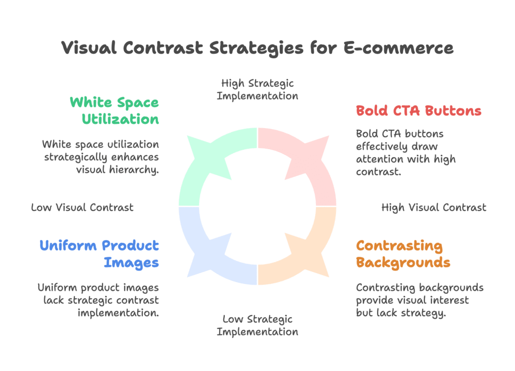
Your call-to-action buttons are prime real estate for this technique. Instead of using your brand’s primary color for everything, create contrast. If your store uses soft, muted tones throughout, make your “Add to Cart” button a bold, contrasting color. A white button on a dark background doesn’t just look clean – it signals importance.
But color alone isn’t enough. You need to think about visual weight. This is where most store owners miss opportunities. Every element on your page has visual weight – some items naturally draw attention, others recede into the background.
Your hero products should visually “weigh” more than your secondary items. This doesn’t mean making them bigger (though size helps). It means surrounding them with white space, using bolder typography, or positioning them against simpler backgrounds.
Consider your product images too. If all your products have white backgrounds, your featured items might get lost in the crowd. Try contrasting backgrounds for different product categories, or use environmental shots for premium items while keeping standard products on clean backgrounds.
Mobile users present unique challenges. With limited screen space, every contrast decision becomes critical. Your mobile visitors need to understand your visual hierarchy instantly. Bold contrasts between your primary and secondary elements become even more important when you can only show three products at a time instead of twelve.
Visual contrast sets the stage, but the real magic happens when you apply contrast to your content and features.
Making Features and Content Stand Out
Here’s something most Shopify store owners get backwards: they bury their best features in walls of text. But what if, instead of hiding these golden nuggets, you made them impossible to ignore through strategic contrast?
Your product descriptions are perfect testing grounds for this concept. Instead of long paragraphs of uniform text, create contrast between benefits and features. Lead with the emotional benefit in larger, bolder text, then support it with technical specifications in smaller, more detailed copy.
For example, instead of: “This watch features a Swiss movement with 42-hour power reserve, sapphire crystal glass, and water resistance to 100 meters,” try: “Never miss a moment that matters” (large, emotional headline) followed by the technical specs in a visually distinct format.
Social proof offers another powerful contrast opportunity. Most stores just list reviews chronologically. But what if you contrasted different types of social proof? Position an expert testimonial next to customer reviews. Show before-and-after photos alongside star ratings. This creates a richer, more compelling narrative.
Your navigation structure can benefit from contrast thinking too. Most stores treat all categories equally. But are all your categories really equal in importance? Create visual contrast between your bestselling collections and your niche offerings. Make your primary navigation bold and prominent, while secondary options remain accessible but subtle.
Product comparison pages are where contrast really shines. Instead of overwhelming customers with feature lists, contrast the key differentiators. If you’re selling laptops, don’t just list specifications – visually contrast what makes each model unique. Is one better for creative work? Make that distinction obvious.
Information architecture isn’t just about organizing content – it’s about creating a journey through contrast. Guide your visitors from broad overview to specific details through progressive disclosure. Each level should feel distinctly different from the last.
But static contrast is just the beginning. The real power emerges when you add the element of time.
Using Time to Create Urgency and Value
Time-based contrast might be the most powerful conversion tool you’re not using. We’re not talking about fake countdown timers (please, don’t do that). We’re talking about genuine temporal contrasts that create authentic urgency.
Seasonal contrasts work beautifully for this. Your summer collection should feel distinctly different from your winter offerings – not just in products, but in the entire shopping experience. Use lighter colors, more dynamic layouts, and energetic copy for summer items, while winter products get richer, more contemplative treatment.
Limited-time events deserve their own visual language. When you’re running a genuine sale or launching a new collection, the entire store experience should reflect this special moment. This doesn’t mean plastering “SALE” banners everywhere. Instead, create a cohesive contrast between your regular store experience and your event experience.
Customer journey contrasts are where things get sophisticated. Your first-time visitors should experience something different from your returning customers. Not different products necessarily, but different emphasis. New visitors might see more educational content and social proof, while returning visitors see personalized recommendations and loyalty benefits.
The post-purchase experience offers unique contrast opportunities. After someone buys from you, they’re in a different mindset. They’ve crossed the trust barrier. This is when you can introduce premium products, exclusive offers, or advanced features that might have seemed overwhelming during their first visit.
Product evolution storytelling creates compelling temporal contrast. If you’ve improved a product, don’t hide the old version – contrast it with the new one. Show the journey, the improvements, the evolution. Customers love being part of a brand’s growth story.
Understanding these principles is one thing, but implementing them strategically? That requires a framework.
Building Your Strategic Implementation Plan
Now comes the real work: turning these principles into a systematic approach that transforms your entire store. You can’t just randomly apply contrast – you need a strategic framework that guides every decision.
Start by mapping your store sections and their contrast opportunities. Your homepage needs different contrast strategies than your product pages. Your checkout process requires different thinking than your collection pages.
Homepage contrast should be dramatic and immediate. Your hero section contrasts against everything else. One powerful message, one compelling image, one clear action. Everything else becomes supporting context. Don’t try to say everything on your homepage – say one thing powerfully.
Collection pages offer perfect opportunities for subtle contrast. Feature your bestsellers or newest items through visual differentiation. This doesn’t mean they need to scream for attention – sometimes the most effective contrast is elegant and refined.
Product pages benefit from option contrast. If you sell variants, make the differences obvious. Size differences, color options, feature variations – each should be visually distinct. Help your customers understand their choices without overwhelming them.
Your checkout process might seem like a strange place for contrast, but it’s crucial. The final steps should feel different from the shopping experience. More focused, more secure, more streamlined. Consider contrasting your checkout environment with soft colors and minimal distractions.
Customer segmentation through contrast creates personalized experiences without complex technology. New customers see different emphasis than returning buyers. Mobile customers might need different visual contrasts than desktop users. Think about how each audience’s needs differ.
Testing becomes essential when implementing contrast strategies. A/B test your contrast decisions. Try different color contrasts, different visual hierarchies, different content presentations. What works for one store might not work for another, even in the same industry.
Heat mapping tools can validate your contrast decisions. Are people looking where you want them to look? Are they clicking on your contrasted elements? Use data to refine your approach.
But theory only goes so far. Let’s look at real examples of contrast in action.
Real-World Success Stories and Practical Examples
Sometimes the best way to understand contrast is to see it in action. Let’s examine how successful stores use these principles without you even realizing it.
Artisanal brands often excel at contrast naturally. A handmade jewelry store might position delicate, minimalist pieces next to bold, statement jewelry. This isn’t accidental – it makes each style appear more distinctive. The delicate pieces seem more refined, the bold pieces more dramatic. Neither would have the same impact alone.
Tech retailers use feature contrasting masterfully. Look at how Apple presents different iPhone models. They don’t just list specifications – they contrast use cases. The Pro version isn’t just “better” – it’s positioned as “for professionals who need advanced features.” The standard version becomes “perfect for everyday users.” Same product family, different contrast positions.
Subscription businesses leverage temporal contrast beautifully. Monthly plans feel different from annual plans – not just in price, but in presentation. Annual plans often get visual treatment that suggests stability and long-term thinking, while monthly options appear more flexible and immediate.
Fashion brands create contrast through styling context. The same dress photographed in a corporate setting sends a different message than when shown at a beach. The product remains identical, but the contrast in presentation appeals to different customer desires.
Bundle presentations benefit enormously from component contrasting. Instead of listing everything included in a bundle, successful stores contrast individual items against the complete package. They might show scattered components transforming into an organized, complete solution.
Theme customization for contrast doesn’t require custom development. Most modern Shopify themes allow you to create visual contrast through color schemes, typography choices, and layout options. The key is using these tools systematically, not randomly.
App integrations can enhance contrast strategies. Comparison tables, before-and-after galleries, and interactive feature explorers all create opportunities for strategic contrast. But choose apps that enhance your contrast strategy rather than competing with it.
Custom sections allow for sophisticated contrast implementations. If your theme doesn’t support your contrast vision, consider custom sections for key pages. These targeted investments often deliver significant returns.
With great power comes great responsibility. Let’s explore how to use contrast ethically and effectively.
Ethical Considerations and Best Practices
Here’s where we separate the true professionals from the digital snake oil salespeople. Contrast is powerful, but with that power comes responsibility. You can use contrast to guide and help customers, or you can use it to manipulate and deceive.
Transparency should guide every contrast decision. If you’re highlighting one product over another, make sure there’s a genuine reason. Is it actually your bestseller? Is it truly new? Is the sale price really limited? Your contrast choices should reflect reality, not create false impressions.
Avoid deceptive contrast techniques. Fake countdown timers, artificially inflated “original” prices, and misleading comparison charts damage trust. Short-term gains from deceptive practices never justify long-term brand damage.
Balance guidance with customer autonomy. Your job is to help customers make decisions, not to manipulate them into specific choices. Good contrast makes options clearer – it doesn’t make decisions for people.
Cognitive load management becomes crucial as you implement more contrast elements. Too much contrast becomes noise. Your customers’ brains can only process so much differentiation before everything starts looking the same again.
The goal is to create enough contrast to guide decision-making without overwhelming the senses. Start with one major contrast element per page, then gradually add others. Test how customers respond at each stage.
Accessibility considerations ensure your contrast strategies work for everyone. High contrast ratios help visually impaired users navigate your store. Color contrasts should be supplemented with other differentiators for customers who can’t distinguish certain colors.
Screen reader compatibility means your contrast strategies should work without visual elements. Alternative text, semantic HTML structure, and logical navigation order ensure everyone can understand your product differences.
Measurement and validation keep your contrast strategies honest and effective. Set up analytics to track how contrast changes affect behavior. Are people engaging with your highlighted products? Are they finding navigation easier? Are conversion rates improving?
Customer feedback provides qualitative insights that numbers can’t capture. Ask customers about their shopping experience. Was anything confusing? Did they notice the differences you wanted them to see?
Iterative improvement ensures your contrast strategies evolve with your business and customers. What works today might not work six months from now. Regular review and refinement keep your store fresh and effective.
Putting It All Together
Contrast isn’t just a design principle – it’s a comprehensive strategy for creating more intuitive, engaging, and profitable shopping experiences. You’ve learned how to use visual elements, content presentation, temporal dynamics, and strategic implementation to guide customers naturally through your store.
The beauty of contrast lies in its subtlety. When done well, customers don’t consciously notice your contrast strategies. They simply find your store easier to navigate, your products more appealing, and their decisions clearer.
Remember: every element in your store is part of a larger composition. Each contrast choice should support your overall brand experience while serving your customers’ needs. Start with small changes, test their impact, and gradually build a more sophisticated contrast strategy.
Your Shopify store has incredible potential waiting to be unlocked. By applying these contrast principles systematically and ethically, you’re not just improving your conversion rates – you’re creating genuinely better shopping experiences.
Want to take your Shopify store’s conversion optimization to the next level? Growth Suite helps merchants increase sales through intelligent visitor tracking and personalized, time-sensitive offers that respect your brand integrity while boosting conversions. Discover how Growth Suite can transform your store’s performance.
References
- Kerwin, B. (2024). “How To Market Your Paintings & Art: The Contrast Principle.” By Kerwin. https://bykerwin.com/how-to-market-your-paintings-art-the-contrast-principle/
- Shopify Partners. (2015). “The Use of Color Contrast in Mobile Ecommerce Design.” Shopify Partners Blog. https://www.shopify.com/partners/blog/68708163-the-use-of-color-contrast-in-mobile-ecommerce-design
- Blimpp. (n.d.). “Contrast Principle.” Blimpp Glossary. https://blimpp.com/glossary/contrast-principle-2/
- FasterCapital. (2025). “The Contrast Conundrum: How the Contrast Principle Intertwines with the Decoy Effect.” FasterCapital. https://www.fastercapital.com/content/Contrast-Principle–The-Contrast-Conundrum–How-the-Contrast-Principle-Intertwines-with-the-Decoy-Effect.html
- Convertize. (n.d.). “Contrast Principle Definition.” Convertize A/B Testing Ideas. https://tactics.convertize.com/definitions/contrast-principle
- Reicher, S. (2023). “The Contrast Principle: Impact on Decision-Making and Company Culture.” LinkedIn. https://www.linkedin.com/pulse/contrast-principle-impact-decision-making-company-culture-reicher-sblae