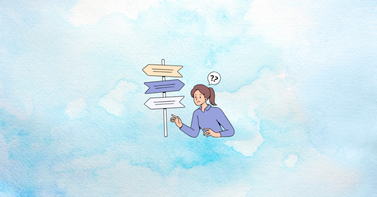
Have you ever felt like your online store layout is too crowded, or that your customers might be leaving because things feel complicated? You’re not alone. Many Shopify store owners wonder how to make each click feel smooth, so that shoppers glide from one page to the next without a second thought. That’s where “cognitive ease” comes in. By the time you finish reading this article, you’ll see how a few design tweaks can keep visitors engaged, lower abandonment, and boost sales. Ready to learn these secrets? Let’s jump right in!
This article explores the idea of cognitive ease and shows you how to simplify your Shopify store layout from top to bottom. You’ll see how human brains process online information and how small improvements in navigation, visuals, and content can increase conversions. If you’ve ever wondered why some store layouts feel like a breeze while others make you want to give up, you’ll soon know the reason. Let’s begin our journey!
Read on, and by the end, you’ll have a toolkit of principles that can guide you toward a more pleasant shopping experience for every visitor. Along the way, you’ll pick up tips on everything from visual design to checkout simplification. Let’s start by exploring what cognitive ease really means.
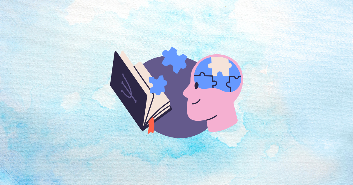
Understanding Cognitive Ease in E-commerce
This section looks at the fundamentals behind cognitive ease, from basic psychology to real business benefits. You’ll discover how simpler store design helps shoppers feel more comfortable and confident when making decisions. Let’s see how our brains work in the online world.
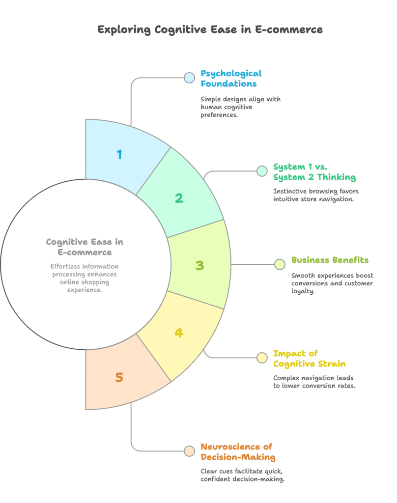
Defining Cognitive Ease and Its Psychological Foundations
Cognitive ease describes how effortless it feels to process information. When a web page is easy to understand, people spend less mental energy figuring things out, and they tend to stay longer and engage more. This concept is grounded in psychology, where researchers have studied how the human mind likes to follow familiar and straightforward paths.
System 1 vs. System 2 Thinking in Online Shopping
Human decision-making involves two systems. System 1 is quick and works on instinct, while System 2 is more deliberate and requires more thought. Shoppers often use System 1 when browsing online, so a store that aligns with instinctive thinking (like having clear visuals and intuitive navigation) feels more comfortable. When visitors have to switch to System 2 unnecessarily, they might lose patience or abandon the store.
The Business Case for Cognitive Ease on Shopify Stores
A smooth user experience often results in higher conversions. When shoppers do not struggle to find products or understand pricing, they’re more likely to trust the store and complete their purchase. This straightforward environment can also encourage repeat visits, because people remember how easy it was to shop.
How Cognitive Strain Impacts Conversion Rates and Abandonment
Cognitive strain happens when shoppers must work too hard to find what they need. Too many steps in navigation, confusing layouts, or unclear calls-to-action can push them away. The result? Lower conversion rates and higher cart abandonment. Removing these obstacles can make a significant difference in your bottom line.
The Neuroscience of Decision-Making in Digital Environments
Our brains process visual and textual cues very quickly. The simpler these cues are to interpret, the more comfortable we feel. Complex or inconsistent layouts slow down decision-making and invite doubt. On the other hand, a design aligned with brain-friendly cues leads to faster and more confident choices.
You’ve just learned why cognitive ease is so important for your Shopify store. Ready to dig deeper into the principles that make this all possible? Let’s move on to the next section.
Key Principles of Cognitive Ease in Store Design
Now that you know what cognitive ease is all about, let’s see the key design principles behind it. Here, you’ll find out why familiarity, visual simplicity, and consistency matter so much for an enjoyable shopping experience.
Familiarity and Recognition Patterns
People feel comfortable when they see familiar layouts and patterns. For instance, a logo linking back to the homepage or a search bar placed in the top-right corner helps shoppers find what they need without extra mental effort. Recognizable elements reduce hesitation because the design matches what the brain expects.
Visual Simplicity and Information Processing
Minimal clutter allows the brain to focus on the main content. When text, images, and buttons are well-organized, shoppers can scan the page and pick out key points easily. Visual simplicity is like a gentle guide that helps users see what’s most important, such as featured products or discount details.
Cognitive Fluency in Navigation and Interaction
Cognitive fluency refers to how easy it is to interact with your store. This might involve simple button labels or logical steps during checkout. If each click feels predictable and intuitive, visitors are more likely to continue shopping. A fluent process keeps them in a “flow” state where exploration happens naturally.
The Role of Consistency in Building Trust
Consistency in design styles, color schemes, and messaging fosters a sense of comfort. When everything looks and feels coherent across your store, customers know they are still in the same environment. Trust grows when small details line up, such as using the same button shape or text style sitewide.
Balancing Aesthetics with Mental Processing Demands
While eye-catching layouts can be helpful, adding too much flair can overwhelm your audience. Strive for a balance where visuals look appealing without overburdening the mind. Subtle design elements that point visitors in the right direction can be more effective than over-the-top decorations.
You’ve seen the main design principles that contribute to cognitive ease. Want to see how these concepts apply to your store’s navigation? Let’s find out!
Optimizing Shopify Navigation for Cognitive Ease
Navigation is the backbone of any online store. In this section, you’ll learn how to streamline menus, create intuitive searches, and keep shoppers oriented. Strong navigation reduces mental work and encourages them to browse more.
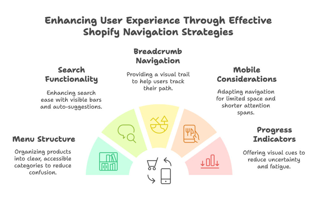
Streamlining Menu Structures and Category Organization
A cluttered menu can confuse shoppers. Group related products into clear categories, and avoid burying items too deeply. Aim for a menu that is simple yet comprehensive enough for people to quickly locate items. This clarity sets a positive tone from the moment a visitor lands on your site.
Implementing Intuitive Search Functionality
Many shoppers prefer searching rather than browsing. Make sure your search bar is easy to spot, and consider adding auto-suggestions that help users spell or find products more quickly. The shorter the path to a product, the simpler it feels.
Breadcrumb Navigation and Spatial Orientation
Breadcrumbs offer a visual trail of where users have been. This simple map can reduce confusion about where a customer is within your store’s hierarchy. It also makes backtracking hassle-free, which is great for mental ease.
Mobile Navigation Considerations for On-the-Go Brains
On mobile devices, space is limited, and attention spans can be shorter. Keep navigation icons visible, use collapsible menus, and ensure buttons are large enough for easy tapping. Simple mobile navigation helps shoppers stay engaged wherever they are.
Progress Indicators and User Location Signposts
Whether it’s a checkout bar or small hints along the way, progress indicators remind users of how many steps remain. This reduces uncertainty, which in turn decreases mental fatigue. When people see exactly where they stand, they’re more motivated to move forward.
Now you know how to create smooth navigation. Next, let’s take a look at visual elements that can reduce mental strain and boost engagement!
Visual Design Elements That Enhance Cognitive Ease
Visual design can make or break a user’s experience. In this section, we’ll see how things like white space, colors, typography, and visual hierarchy work together to keep your store easy on the eyes (and the mind).
Strategic Use of White Space and Visual Breathing Room
White space is more than just empty areas. It guides the eye and makes content easier to absorb. When you position images or text with enough breathing room, shoppers have time to process information instead of feeling bombarded by clutter.
Color Psychology and Cognitive Processing
Colors can influence mood and behavior. Simple and consistent color schemes help people quickly recognize clickable elements and important messages. Choose colors that are easy on the eyes, and avoid too many bright, competing hues that could overload the senses.
Typography Selection for Maximum Readability
Fonts with clear letters and good spacing can reduce reading difficulties. Stick to font sizes that are legible on both desktop and mobile. A well-chosen typeface not only adds style but also helps visitors read product descriptions without straining their eyes.
Visual Hierarchy and Attention Direction
Directing attention involves using bigger, bolder elements for the most important parts of the page, such as headlines or product offers. Smaller, less prominent text can be used for details. This natural hierarchy guides shoppers’ eyes in the right order.
Image Optimization for Quick Mental Processing
High-quality images that load fast give shoppers a clear idea of what they’re browsing. Large, detailed photos capture attention, but make sure they don’t slow down your site. Quick-loading visuals keep the flow going, preventing mental breaks due to waiting.
With visuals under control, it’s time to look at how we present content in a way that keeps customers fully informed without overwhelming them. Ready to keep going?
Content Presentation for Reduced Cognitive Load
Content is king, but too much text can tire readers. In this section, you’ll learn how to write product descriptions and other text so they’re engaging and easy to absorb, leading to happier customers who stick around.
Writing Product Descriptions with Cognitive Fluency
Short sentences and clear language help users understand your products fast. Highlight the main benefits, and let shoppers know why they should care. The easier the language, the smoother their decision-making process becomes.
Chunking Information for Easier Processing
Chunking means breaking big blocks of text into smaller segments. Use bullet points, subheadings, or short paragraphs. This structure offers quick takeaways and reduces the mental effort of scanning long paragraphs.
Using Simple Language and Avoiding Jargon
If customers need a dictionary to understand your descriptions, they may leave. Stick to everyday words, and clarify any special terms right away. A friendly tone keeps people from feeling out of their depth.
Product Comparison Tools to Reduce Memory Strain
When shoppers compare multiple items, providing a simple comparison chart can save mental energy. Clearly list features side by side so they can weigh their options without switching back and forth between pages.
Balancing Information Completeness with Simplicity
It’s good to be thorough, but don’t bury crucial details under excessive text. Show the essentials first, and let shoppers click for more information if they want it. This approach suits both quick browsers and those who like deeper details.
You’ve mastered content presentation. Next, let’s focus on product pages, where decisions really take shape!
Optimizing Product Pages for Decision Simplicity
In this section, you’ll see how to refine product pages so choices are straightforward, pricing is clear, and social proof feels natural. Make these tweaks, and you’ll likely see a boost in both buyer confidence and conversions.
Streamlining Product Options and Variants
Too many choices can create doubt. Group variants in a way that’s easy to compare, like using dropdown menus. Keep the options clear so visitors quickly find what they need without flipping through multiple pages.
Clear Pricing Presentation Strategies
Pricing details should be obvious. If you have discounts, show the before-and-after price side by side. This immediate clarity reduces confusion and builds trust. Make sure taxes, shipping, or any extra fees are also explained upfront.
Social Proof Elements That Build Trust Effortlessly
Adding reviews, ratings, or testimonials can make shoppers feel more secure. When they see others’ experiences, it reduces uncertainties. Place these elements near your call-to-action buttons for maximum impact.
Call-to-Action Optimization for Intuitive Next Steps
Use clear labels like “Add to Cart” or “Buy Now.” Simple text stands out more than fancy phrases. Make sure the button is easy to see and ideally placed near important product details.
Reducing Choice Paralysis Through Curated Recommendations
If your store has a big catalog, suggest a few related items rather than showing every possible option. Presenting fewer, more relevant items lowers the mental load. This approach increases the chance that shoppers will find something they like.
We’ve fine-tuned product pages, but what about the final step—checkout? Let’s head there next!
Checkout Process Simplification
All your hard work can go to waste if checkout feels complicated. This section reveals how to minimize form fields and make payment options straightforward, so buyers finalize purchases with ease.
Minimizing Form Fields and Input Requirements
Ask only for the information you truly need. Long forms can cause cart abandonment. If you can, auto-fill addresses or let customers save details for future purchases. Simplicity in this area can lead to higher completion rates.
Progress Indicators and Completion Feedback
Small steps are easier than one massive jump. Show which step the shopper is on (e.g., shipping, payment, review) and confirm each step along the way. Positive feedback helps them feel closer to finishing, which boosts motivation.
Guest Checkout Options and Registration Friction
Not everyone wants to create an account. Offering a guest checkout encourages quick purchases. You can still provide the option to register afterward if they choose. Fewer mandatory steps mean fewer reasons to leave.
Payment Method Presentation for Quick Decision-Making
Show different payment options clearly, using recognizable icons. Make it simple for users to see and select their preferred method. This direct approach saves time and prevents doubt at a critical stage.
Error Prevention and Recovery Mechanisms
Use real-time validation to catch errors as they happen (like a mistyped email). Clear error messages help shoppers fix issues quickly. The faster they can fix a mistake, the more likely they’ll complete the purchase.
We’ve nailed down the checkout flow. Now let’s consider mobile optimization, which is crucial in a world where many shoppers are on their phones.
Mobile Optimization for Cognitive Ease
Mobile users deserve an experience that feels just as smooth as on desktop. In this section, you’ll learn how to design for thumbs, ensure responsive layouts, and keep performance snappy so nobody gets bored waiting.
Thumb-Friendly Navigation and Interaction Zones
People often use one hand when browsing on their phones. Keep essential buttons and menus within easy reach, so thumbs don’t have to stretch. This approach reduces accidental taps and keeps the focus on shopping.
Responsive Design Principles for Cognitive Consistency
A responsive site automatically adjusts to different screen sizes. Consistent designs across devices let shoppers recognize your brand instantly. Everything should scale gracefully, from images to navigation menus.
Touch Target Sizing and Spacing for Error Reduction
Small buttons can lead to wrong clicks. Use comfortable touch targets (at least 44×44 pixels) and leave enough space between elements. This step avoids frustration and keeps the experience smooth.
Content Prioritization on Small Screens
Mobile screens limit how much information you can show at once. Place the most important content at the top and let users scroll for details. Short headlines, concise text, and simple visuals work best here.
Performance Optimization for Perceived Speed
Nobody likes waiting for pages to load. Compress images and minimize unnecessary scripts so your store feels fast. Quick performance keeps the shopping momentum going and prevents drop-offs.
With mobile users taken care of, let’s see how to measure and test the progress you’ve made in creating a user-friendly store.
Testing and Measuring Cognitive Ease
This section shows you how to track improvements in user comfort. You’ll learn what metrics matter, how to run A/B tests, and how user testing reveals friction points you might have missed.
Key Performance Indicators for Cognitive Ease
Consider metrics like bounce rate, time on page, pages per session, and cart abandonment. Drops in cart abandonment or increases in average session duration might indicate success in reducing mental effort.
A/B Testing Methodologies for Layout Optimization
Run experiments where half of your visitors see one design, while the other half sees a different version. Compare which version leads to better conversions. Small tweaks in headings or button styles can sometimes lead to big wins.
User Testing Techniques to Identify Cognitive Friction
Observe real users navigating your store, either in person or through screen recordings. Pay attention to moments where they pause or backtrack. These spots often signal potential confusion or friction.
Analytics Setup for Tracking Ease-Related Metrics
Use analytics tools to set up funnels that show where people drop off. Track events like button clicks or form completions. A well-structured analytics setup helps you see exactly where improvements are needed.
Continuous Improvement Framework for Cognitive Optimization
Even a great store can get better. Keep testing and refining your layout, navigation, and visuals. Regular updates ensure you stay in tune with changing trends and user expectations.
Now that you have data-driven ways to measure success, let’s round out the entire customer journey and see how cognitive ease plays a part from pre-purchase to post-purchase.
Implementing Cognitive Ease Across the Customer Journey
In this final section, we’ll piece together everything you’ve learned, from attracting potential buyers to retaining satisfied customers. Let’s see how to make each stage feel effortless.
Pre-Purchase: Building Familiarity Through Marketing
Introduce consistent design and messaging in your ads and social media posts. That way, when people land on your store, it looks and feels like the brand they already know. Consistency from the start reduces uncertainty.
During Purchase: Maintaining Flow State Through Checkout
Keep the momentum going by removing distractions during checkout. Show a clear path to completion, confirm each step, and avoid unnecessary questions. A smooth flow nurtures a sense of progress that encourages completion.
Post-Purchase: Reinforcing Positive Experiences
After a customer buys, send clear order confirmations and updates. A well-designed confirmation page and easy-to-read email reassure them that everything is on track. This leads to higher satisfaction and repeat visits.
Creating a Holistic Approach to Cognitive Ease
Cognitive ease isn’t just about one page. It’s about making sure every step, from first click to final thank-you, feels seamless. When each part of the journey fits together, shoppers enjoy the process and come back for more.
Future Trends in Cognitive Design for E-commerce
As user interfaces evolve, simplicity remains a primary goal. Look out for AI-powered personalization that can suggest exactly what each individual shopper wants. No matter the technology, the core principle stays the same: keep it straightforward.
You’ve reached the end of our deep look into designing for cognitive ease. Now let’s review our sources and see how you can take the next step to boost your store’s success!
References
- Shopify. (2024). How Cognitive Ease Helps Consumers Make Quick Decisions. https://www.shopify.com/blog/cognitive-ease
- Captains and Cowboys. (2024). How Cognitive Ease Influences Consumer Decision-Making in E-Commerce. https://captainsandcowboys.com/how-cognitive-ease-influences-consumer-decision-making-in-e-commerce/
- ConvertCart. (2022). 18 UX hacks to reduce cognitive load in ecommerce. https://www.convertcart.com/blog/reduce-cognitive-load
- Bizmia. (2025). Enhance Shopify Store Design with these Best Practices. https://www.hellobizmia.com/insights/shopify-store-design-tips
Ready to supercharge your Shopify store’s sales with perfectly optimized discount codes? Growth Suite is a Shopify app that helps you do just that. Install it with a single click and start seeing results!